Outbuild Your Competition: The 2026 Construction and Trades Digital Playbook to Win Bids

Dual image showcasing a luxurious commercial interior design ("Go Beyond The Build") juxtaposed with construction trades workers on a steel rooftop structure, representing full project lifecycle management.
The modern construction firm must “Go Beyond The Build,” demonstrating the full scope of project mastery from sophisticated design and planning to on-site quality control and final delivery.

Your Website Should Be Your Best Salesperson

Let’s be honest: your website is working harder than anyone on your team. It never sleeps, never takes vacation, and it most likely meets every prospect before you do.

The question is—but, is it actually closing deals?

For construction and trades, your website isn’t just a nice-to-have. It’s your most powerful business development tool. Yes, we know it’s about building relationships, being a great “culture” company, and more… but in 2026, the firms winning the best projects are the ones who’ve figured out that their online presence is what makes the difference in closing big deals.

This playbook gives you everything you need: the strategic framework, real numbers, and practical steps to build a website that converts visitors into qualified leads. Whether you’re planning a redesign or starting fresh, think of this guide as your roadmap to turning your website into a revenue machine.

This is real advice–not an AI bot. Jacob Tyler is a brand and creative agency with over 25 years of experience building global brands and watching them succeed. This is not Ai. This is real talk from real experts working with brands from 1 million to over 4 billion in the A/E/C space. 

Look, we know our audience here ranges wildly. You might be a one-truck operation just getting started, or a multi-billion dollar firm with offices in 15 states.

It’s impossible to write one playbook that speaks perfectly to everyone. A 25-year-old launching their first contracting business isn’t thinking like a 60-year-old industry veteran with decades of wins under their belt.

But here’s what we’ve learned after working with over 30 construction companies across every size and stage: the fundamentals don’t change. Whether you’re trying to land your first $100K job or your next $10M project, the principles in this guide will help you do it.

Why Your Website Matters More Than Ever

Here’s the reality: there are nearly 4 million construction companies in the U.S. Construction is still a relationship business. Deals happen over lunch, on the golf course, through referrals from guys you’ve known for 20 years.

But here’s what’s happening while you’re shaking hands: 63% of prospects are already sizing you up online. Your website is their first impression—and for most of them (not the guys you have known for 20 years… although they are reviewing your Website. Trust me.), it’s the deciding factor before they even call you back.

You don’t know what you don’t know. But your customers? They’re looking. And they’re looking online.

Today’s site (whether small or large) needs to do two things exceptionally well: build credibility and generate leads.

The Numbers Don’t Lie

You’ve got 3 seconds on average to grab someone’s attention on your homepage. That’s it. And let’s be honest, 3 seconds can seem like a lifetime when you’re waiting for a page to load. The only worse position to be in would be a boxing ring. You need to make it super fast to prove you’re worth talking to (and winning the fight).

Here’s the reality: 70% of prospects start on mobile. They’re browsing your work from the job site, in the truck, between meetings.

But they’re not making decisions there. That happens later, on desktop—when they’re digging into portfolios, comparing firms, and getting ready to reach out.

So if your mobile site is clunky, you’re eliminated before the real evaluation even starts. And if your desktop experience doesn’t deliver? All that mobile interest dies at the finish line.

You need both. Period.

The cost of getting this wrong? Well if you’re paying for ads, the average cost per lead from search ads in construction is $165.67. If your website can’t convert that traffic, you’re literally burning money. If you’re not paying for ads, you just burned money on a Website that people leave.

Bottom line: in a crowded market, your website is where differentiation starts. Get it right, and you’re ahead of the competition before the first conversation.

The 5 Pillars of a High-Performing Construction Website
Digital screens showcasing a modern construction and trades website, emphasizing the firm's portfolio, content strategy, and digital marketing playbook.
A strong digital presence is central to the 2026 playbook. Your professional, content-rich website is the foundation for SEO, lead generation, and winning more bids.

Pillar 1: Show Off Your Work

Your portfolio is your proof. But dumping 200 random projects on a page doesn’t build confidence—it overwhelms people.

Here’s what actually works:

Professional photography that shows the details. Clients want to see your craftsmanship, the scale of your projects, and the finished results. Skip the generic stock photos of hard hats and blueprints. Show your actual team, your trucks, your job sites.

Make it easy for visitors to find what they’re looking for. Organize your portfolio by project type (commercial, residential, industrial) and service (new construction, renovation, design-build). Let people filter to find projects like theirs.

Tell the full story. Go beyond pretty pictures. For your best 15-25 projects, include the scope, timeline, challenges you solved, and what the client said about it. Make it personal.

Before-and-after shots are absolutely worth the effort. They prove the dramatic change you created in a way nothing else can.

Look, we get it. Remembering to snap that “before” shot when you’re managing a dozen things on day one? Nearly impossible. We’ve been guilty of forgetting to do that with our own client brand projects.

It’s not the end of the world if you miss a few. But when you do capture that contrast—the messy teardown next to the stunning finish—it changes how prospects see your work. That visual proof can be the difference between “looks nice” and “we need to hire them.”

What kills trust:

  • Generic stock imagery – It’s okay to have a few images but let’s try to keep it to a minimum
  • Walls of text that bury the visuals
  • Projects from 40 years ago (save those for your company history page)

The Bottom Line: Your portfolio should tell stories, not just display photos. When someone can see themselves in your work—and see the results you delivered for clients like them—that’s when trust begins.
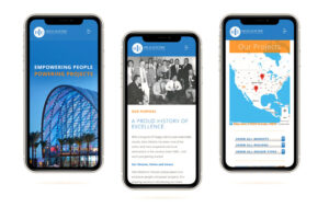
Three mobile phone screens displaying a construction company's responsive website, showcasing their mission, history of excellence, and a map of their nationwide project locations.
A mobile-optimized website is the foundation of the 2026 digital playbook, immediately showcasing brand history, mission, and geographical reach to potential clients.

Pillar 2: Mobile-First Design That Actually Works

Speed and mobile aren’t “nice features”—they’re deal-breakers.

Google punishes slow sites. In fact, in 2016, our CEO Les Kollegian was hired by Google to speak at their conferences about this exact issue. Here’s the stat that should terrify you: for every extra second your page takes to load, your bounce rate jumps 8X higher.

Think about that. One extra second. Eight times more people, gone.

If you don’t know how to optimize your site properly—and most don’t—you’re hemorrhaging traffic and conversions without even realizing it. And with over 70% of construction buyers starting their research on mobile, building for phones isn’t optional anymore. It’s fundamental.

Don’t get us wrong. Desktop design is EXTREMELY important. However, mobile-first in the A/E/C vertical is how all companies should be thinking. Once they’re evaluating a project or issuing a bid, your prospects are likely to switch to a larger screen to review PDFs, drawings, case studies, and detailed qualifications. A robust, desktop-friendly experience helps with credibility, downloads, and document access.

What matters:

Load time under 3 seconds. Period. Every second longer and you’re losing people.

Easy navigation for thumbs, not mouse cursors. Big buttons, smart spacing. Remember, your best trades might be on a job site wearing gloves. Your best prospect may be doing research while waiting for his/her cocktail at the bar. 

Images that look great on small screens. Don’t sacrifice visual impact, but optimize everything so it loads fast.

Simple forms. Mobile users won’t fill out 15 fields. Keep it to name, email, phone, and project type.

Here’s a stat that should scare you: mobile users are 5 times more likely to abandon a site that isn’t optimized. You can’t afford to lose half your audience because your site looks bad on a phone.

The Bottom Line: If your site doesn’t work flawlessly on mobile, you’ve disqualified yourself from the majority of potential clients before they even see your work.

Practical guidance:

  • Start with a mobile-first design mindset:
    • Fast load times (optimized images, compressed videos, lean code).
    • Clear navigation with prominent project gallery, capabilities, and contact.
    • Accessible CTAs (Get a quote, Request a proposal, Call now).
    • Readable typography, concise copy, and scannable sections.
    • Strong, trust-building elements: client logos, case studies highlights, safety records, licenses, certifications.


Pillar 3: Build Trust Before the First Call

Construction is a relationship business–and trust is everything. Your website needs to prove you’re legitimate, capable, and reliable and yes… trustworthy—before someone picks up the phone.

Essential trust-builders:

Show your credentials. Certifications, licenses, insurance, safety records. Display logos from your suppliers and partners. Make it obvious you’re the real deal.

Sounds basic, right?

We’ve worked with companies doing $50 million+ in revenue who don’t do this. Their response? “We have enough business.”

Our response? Do you, though? Because “enough” isn’t the same as “all the business you could have.” What are you leaving on the table by making prospects guess whether you’re legit? Trust signals aren’t just for startups trying to prove themselves. They’re for every company that wants to convert more of the traffic they’re already getting. 

Real testimonials with real details. “Saved us 15% on materials and finished two weeks early” beats “Great to work with!” every time. Use names, titles, photos if possible.

Introduce your team. People want to know who they’re hiring. Real photos of real people build connection.

Highlight your track record. OSHA ratings, safety certifications, project completion rates—these signal operational excellence.

Here’s why this matters: 47% of buyers look at 3-5 pieces of content before they’ll even talk to a salesperson. Make it easy for them to say yes by giving them the proof points they need.

The Bottom Line: Trust isn’t given, it’s earned. Your website should make it effortless for prospects to find the evidence they need to feel confident about working with you.

Pillar 4: Make It Stupid-Easy to Contact You

Every page should have a purpose. Every purpose should have a clear next step.

If someone’s interested, don’t make them hunt for how to reach you.

What converts:

Multiple ways to get in touch. “Request a Bid,” “Schedule a Consultation,” “Get an Estimate,” “Download Our Capabilities Deck.” Different people want different entry points.

Click-to-call on mobile. 61% of mobile users will call during the buying process. Make the phone number tappable everywhere.

Contact options that follow them. Sticky contact bars or chat widgets that stay visible as people scroll.

Forms right where they’re looking. Put inquiry forms directly on portfolio pages so prospects can reach out while viewing relevant work.

The math: you’re paying $165+ per lead from search ads. If your site doesn’t make it easy to convert, you’re wasting that investment.

Pro tip: Keep forms short. Name, email, phone, project type—that’s enough for a first conversation.

The Bottom Line: Every page needs a clear “do this next” moment. The easier you make it to contact you, the more qualified leads you’ll capture.

Pillar 5: Get Found by the Right People

A beautiful website is worthless if no one can find it.

The firms that dominate their markets don’t just build great sites—they make sure those sites show up when potential clients are searching.

The technical stuff (simplified):

Make sure your site is fast, clean, and organized in a way that search engines—and now AI—can understand. This includes things like clear page titles, good site structure, and behind-the-scenes code that helps Google, ChatGPT, Perplexity, and other AI tools figure out what you actually do.

Here’s why this matters more than ever: people aren’t just Googling anymore. They’re asking ChatGPT “who are the best commercial contractors in [city]?” or using AI search tools to compare firms. If your site isn’t structured properly, you won’t show up in those results—even if you’re the perfect fit. AI reads your site differently than humans do, and if it can’t parse your information clearly, you’re invisible in the fastest-growing search channel out there.

The content strategy:

Content marketing generates 54% more leads than traditional marketing. Adding a blog to your site increases your chances of ranking on Google by 434%.

Here’s what to create:

Service pages that match what people search for. Think “commercial general contractor in [your city]” or “design-build services in [your region].”

Project case studies with location details. Construction is local. Make sure every case study includes where the project was and what type of work it involved.

Educational content that answers questions. Blog posts like “How long does commercial construction permitting take?” or “What’s the difference between design-bid-build and design-build?” These attract people early in their research process.

The Bottom Line: SEO isn’t optional—it’s your primary lead source. Build it into your website from day one, target the searches your ideal clients are making, and create content that answers their questions. Do this right and your site becomes a lead-generating machine. And for those of you who don’t believe you are being found via search in any capacity. Aehhhhhhhh (buzzer sound). You have NO idea. At Jacob Tyler, we never thought in a million years that an executive at Sony would be upset with his current agency and “search” for another and find us. Being optimized for search got us that account and assistance developing the VAIO brand for Sony. So yeah, we believe. We will give you some more information on “search” in a little bit.

Design Trends That Actually Matter in 2026

Clean and Simple Wins

Less is more. White space, clean fonts, minimal navigation. Focus attention on what matters—your work.

Large Typography

Use of clean and modern typography in a large point type grabs attention and keeps it. Don’t overdo it though. Remember that people need to be attracted to read more and not yelled at. 

Video Makes a Difference

Time-lapse build videos, drone footage, client testimonials. Video tells stories in ways photos can’t.

Dark Mode Is Here

Dark backgrounds with sharp contrast can make architectural work pop. It’s modern, striking, and effective. With that said, be careful to not have too much body copy in reverse (white on top of black) as it can make paragraph content more difficult to read. 

Subtle Motion Adds Polish

Hover effects, scroll animations, interactive filters. Small details that make the experience feel premium without overwhelming users.

Sustainability Messaging Matters

Affiliations, green building practices, LEED certifications, energy-efficient outcomes—these resonate with commercial clients and conscious homeowners alike.

What a Professional Website Actually Costs

Let’s talk money. Here’s what you should expect to invest:

Small to Mid-Size Firms: $15,000 – $25,000

You get:

  • 15-25 pages
  • Custom design that’s mobile-responsive
  • 10-15 portfolio projects
  • Contact forms and lead capture
  • Basic search optimization
  • Timeline: 10-14 weeks

Best for: Local contractors, small commercial builders, residential remodelers

Mid-Size to Large Firms: $25,000 – $55,000+

You get:

  • 30-50+ pages
  • Advanced functionality and design
  • 25-50 portfolio projects with filtering
  • Integration with your CRM and project tools
  • Comprehensive SEO strategy
  • Blog and content marketing setup
  • Video integration
  • Timeline: 14-20 weeks

Best for: Regional general contractors, design-build firms, commercial construction companies

Enterprise-Level Firms: $55,000 – $100,000+

You get:

  • 50-100+ pages
  • Fully custom everything
  • Multi-location support
  • Project portals and employee logins
  • Interactive maps and advanced showcases
  • Marketing automation
  • Ongoing optimization and testing
  • Timeline: 20-24+ weeks

Best for: National contractors, large commercial builders, industrial construction firms

Ongoing Maintenance: $1,500 – $3,000/month

Includes:

  • Security updates
  • New project additions
  • SEO monitoring
  • Performance optimization
  • Analytics reviews

Think of this as the cost of keeping your best salesperson sharp and effective. Keep in mind that most Websites as mentioned above can be developed in WordPress, which is infinitely scalable so even though you may start with 15 to 20 pages, you can add as many as you like, and it is super easy to do so.

Mistakes That Kill Conversions

  1. Portfolio overload. Quality beats quantity. Show your best 15-25 projects, not every job you’ve done since 1985.
  2. Ignoring mobile. If it doesn’t work on a phone, you’ve lost the lead. Period.
  3. Hiding your call-to-action. Every page should answer: “What should I do next?” Make it obvious.
  4. Treating SEO as an afterthought. 57% of B2B marketers say SEO generates more leads than anything else. Build it in from the start.
  5. Slow load times. Users leave. Google penalizes. You lose.
  6. No way to track results. If you can’t measure it, you can’t improve it. Set up tracking for form submissions, calls, and key pages.
  7. Stale content. A portfolio that stops in 2019 signals a business that stopped growing. Update regularly.

How to Know If It’s Working

Track these numbers to measure your website’s impact:

  • Traffic growth (month-over-month and year-over-year)
  • Conversion rate (forms, calls, downloads as a % of visitors)
  • Bounce rate (target under 40% on key pages)
  • Time on site (longer = more engaged
  • Search rankings for your target terms
  • Leads generated (qualified inquiries)
  • Cost per lead (compared to other channels)
  • Projects won from web inquiries

The goal isn’t to hit industry averages—it’s to beat your own baseline. A 20% lift in traffic or a 0.5% bump in conversion rate translates directly to revenue.

Your 2026 Website Checklist

Use this when evaluating proposals or scoping your project:


Strategy & Planning

  • Audience personas defined
  • Competitor analysis completed
  • Keyword research done
  • Conversion goals established
  • Site structure approved


Design & Experience

  • Mobile-first, responsive design
  • Loads in under 3 seconds
  • Clean layouts with white space
  • High-quality, authentic photos (no stock)
  • Consistent branding throughout


Content & Messaging

  • Clear value proposition on homepage
  • Service pages optimized for search
  • 10-20 featured projects with case studies
  • Client testimonials (text or video)
  • Team bios and photos
  • Trust signals visible (certifications, licenses)


Functionality

  • Contact forms on key pages
  • Click-to-call phone numbers
  • Filterable project portfolio
  • Blog/resources section
  • Secure hosting and backups


SEO & Analytics

  • Google Analytics installed
  • Search Console configured
  • Page titles and descriptions optimized
  • Sitemap submitted
  • Redirects set up (if redesign)


Post-Launch

  • Tested across all devices
  • Monthly analytics reporting
  • Content update plan in place
  • Ongoing optimization strategy defined

Common Questions Answered

How much should I really spend on a website?

For most construction companies, expect to invest $15,000 to $75,000+ depending on complexity and scale.

Think of it this way: if a well-designed site generates even 3-5 additional qualified leads per month, it pays for itself within months. The question isn’t “what’s the cheapest option?” It’s “what delivers the best return?” 

How long does it take to build?

Quality takes time. Most projects run 10-16 weeks from kickoff to launch. Smaller sites might be done in 8-10 weeks. Enterprise sites with complex features can take 20-24 weeks.

Rushing usually means compromising quality. Launch something you’re proud of, not something you’re settling for.

Do I really need mobile optimization?

Absolutely. Over 70% of potential clients browse on mobile before making a decision. Google ranks your mobile site first. Mobile users are 5X more likely to bail on a site that doesn’t work properly.

If your site doesn’t work flawlessly on phones, you’re eliminating the majority of your market.

Can I just use a template?

Sure, if you want to blend in and hope for the best.

Template platforms like Wix or Squarespace are cheap upfront, but they come with hidden costs that kill your competitiveness. Here’s why they fall short for construction companies:

  1. Speed kills your conversions. These platforms are bloated with code you don’t need. They’re slower out of the box, and you can’t optimize them the way a custom site can. Remember: every extra second costs you 8X more bounces.
  2. You’re locked into their limitations. Need a custom project filtering system? Want to integrate with your CRM? Looking to build something unique that sets you apart? Good luck. Templates box you into what everyone else is doing.
  3. SEO is hobbled from the start. Sure, they claim to be “SEO-friendly,” but you can’t control the technical foundation the way you need to. Your ability to rank for competitive local terms is significantly hampered compared to a properly built custom site.
  4. You look like everyone else. Prospects can spot a Squarespace template from a mile away. When you’re competing for six- and seven-figure projects, looking like a DIY startup doesn’t inspire confidence.
  5. AI can’t read it properly. These platforms generate messy code that makes it harder for AI search tools (ChatGPT, Perplexity, etc.) to understand and recommend your business. You’re invisible in the fastest-growing search channel.
  6. Mobile experience is “good enough” at best. Remember that 70% of your prospects start on mobile? Template platforms give you a responsive site, but not an optimized one. There’s a massive difference.

The bottom line: when your average project is worth $50K to millions, a $200/year website isn’t a smart savings—it’s a costly compromise. Investing in a professional custom site delivers exponentially better ROI because it actually converts the traffic you’re working so hard to generate.

How often should I update it?

A website isn’t a “set it and forget it” asset. It’s a living business tool that needs regular attention to stay effective.

At minimum, add new projects quarterly. Fresh content tells both visitors and search engines you’re active and growing. But there’s more to it than that.

Why regular updates actually matter:

Search engines reward fresh content. Google prioritizes sites that consistently publish new material. A site that hasn’t been touched in six months gets buried, while competitors updating regularly climb the rankings. This isn’t theory—it’s how the algorithm works.

AI search needs current data. ChatGPT, Perplexity, and other AI tools pull from recently updated sources. If your site is static, you’re invisible in AI-powered search results—the fastest-growing way people find contractors.

Your prospects are watching. When someone lands on your site and sees your last project is from 2022, what do they think? Either you’re not busy (red flag) or you don’t care about your digital presence (also a red flag). Fresh content signals momentum and success.

SEO compounds over time. Every new blog post is another opportunity to rank for search terms. Every updated project page strengthens your local SEO. This isn’t busy work—it’s building equity that generates leads for years.

Ideal update cadence:

  • New blog posts monthly – drives SEO, answers buyer questions, positions you as an expert
  • Portfolio updates quarterly – keeps your best work front and center
  • Testimonials as you receive them – fresh social proof builds trust faster
  • Service pages refreshed annually – keeps messaging aligned with your current capabilities and market positioning
  • Technical SEO audit quarterly – ensures your site stays optimized as search algorithms evolve

Should you hire someone to manage this?

Unless you have a dedicated marketing person who understands SEO, content strategy, and technical optimization—yes, absolutely.

Here’s why: most construction company owners don’t have time to write optimized blog posts, resize images properly, update meta descriptions, monitor search rankings, or stay current on algorithm changes. And frankly, you shouldn’t. Your time is worth more managing projects and closing deals.

A monthly retainer with a specialized agency or freelancer ($1,500-$5,000/month depending on scope) typically includes:

  • Regular content creation and optimization
  • Portfolio and project page updates
  • SEO monitoring and adjustments
  • Technical performance optimization
  • Analytics reporting so you see what’s working

Think of it this way: if your site generates even 2-3 additional qualified leads per month because it’s consistently updated and optimized, that monthly investment has already paid for itself several times over.

The bottom line: A stale website signals a stale business. But more importantly, an outdated site actively costs you leads, rankings, and revenue. Regular updates aren’t optional maintenance—they’re how your website continues generating ROI long after launch.

What’s the difference between a brochure site and a lead generation site?

Brochure sites build trust and credibility through compelling storytelling, professional imagery, and showcases of your work. When designed thoughtfully, they serve as powerful digital portfolios that help potential clients understand who you are, what you do, and why they should work with you. For smaller businesses especially, a well-crafted brochure site with clear contact options and conversion points can be exactly what’s needed to turn visitors into leads.

Lead generation sites take this foundation further by prioritizing conversion at every turn—with multiple strategic calls-to-action, optimized user journeys, lead capture mechanisms throughout the experience, and content specifically designed to move visitors down the funnel.

Both approaches should ultimately drive leads and conversions. The difference is in emphasis: brochure sites lead with trust-building and storytelling, while lead generation sites lead with conversion optimization—but the best sites often blend elements of both.

We have plenty of business. Does SEO really matter?

Look, I get it. We hear this all the time: “We don’t need to worry about our website because we don’t get business from it anyway.”

But here’s the thing—comfort is the enemy of growth.

Think about it: why would you turn down the chance to be considered for projects you didn’t even know existed? Projects where the prospect finds you instead of you having to chase them down?

When we push back and ask “How do you actually know you’re not getting business from your site?”, there’s usually just crickets. Or worse, assumptions based on… well, nothing.

Here’s a story (in case you missed it earlier) that changed everything for us. Years ago, we won the brand development for Sony VAIO products for college students. Want to know how? A Sony senior executive (fed up with his current agency relationship) literally Googled agencies and found us. We didn’t even think that was possible. But it happened, and we became true believers.

Fast forward to 2025. We redesigned the website for Dempsey Construction. About three months after launch, Michaela Weibel, their Director of Marketing, called us—absolutely shocked. She’d been there over five years and had never received a single lead through their website. Not one.

With the new site and proper optimization? Leads started coming in.. and while just a few, it is certainly better than none. Now they’re actually in the game instead of watching from the sidelines. And get this—just one deal pays for the entire website investment and then some.

But it gets even better. At Jacob Tyler, we’re now landing clients through something most agencies aren’t even thinking about yet: generative search.

Sure, people still Google “Best Web Design Agencies in San Diego” or “Construction Web Designer”—and we show up for those. But recently, an executive asked Gemini (Google’s AI), “Who designed the Hensel Phelps website?” Because we optimized our site for generative search, they got the right answer: us. We won that client.

This is the new reality. In 2026, if you’re in construction and you’re not optimized for generative search—especially around your completed projects—you’re invisible to a massive chunk of potential clients.

Should I hire a construction specialist or a general agency?

Here’s our honest take, and we’d be lying if we told you otherwise: you don’t need an agency that only does construction.

We’ve been doing this for 25 years at Jacob Tyler. In that time, we’ve built high-performing websites for health and life sciences companies, medical product manufacturers, ecommerce brands, financial services firms, and yes—construction and industrial companies. The idea that an agency must be vertically niched to deliver results? That’s marketing spin, not reality.

What you actually need is this:

An agency that takes the time to deeply understand your buyers, your sales cycle, your competitive landscape, and what drives decisions in your market. Whether that’s construction, manufacturing, or healthcare doesn’t matter as much as their commitment to learning what makes your business tick.

That said, industry experience does accelerate results.

When an agency has worked with construction firms before, they come to the table knowing:

  • How to structure project portfolios that actually convert
  • Which trust signals matter most (certifications, safety records, bonding capacity)
  • How to optimize for the long, relationship-driven sales cycles typical in construction
  • What questions prospects ask before they’re ready to request a bid
  • The balance between showcasing capabilities and not overwhelming decision-makers

That expertise means faster onboarding, fewer missteps, and a site that performs from day one instead of needing months of trial and error.

But here’s what matters more than niche experience:

Does the agency have a track record of driving measurable results? Do they understand conversion optimization, SEO, user experience, and content strategy at a deep level? Can they point to specific outcomes—increased leads, higher rankings, improved conversion rates—across any B2B vertical?

Those fundamentals transcend industry. A team that’s driven results in financial services or life sciences can absolutely apply that same rigor and strategic thinking to construction. The principles of effective digital marketing don’t change just because the hard hats do.

The bottom line:

Choose an agency based on their strategic chops, their commitment to understanding your specific market, and their proven ability to deliver ROI—not just their client roster. Industry experience is a plus and can accelerate results, but it’s not a requirement. Deep expertise in digital strategy, combined with genuine curiosity about your business, will always outperform shallow “niche specialist” credentials.

At Jacob Tyler, we bring both: 25 years of cross-industry experience and a proven track record in construction and industrial markets. That combination means we know what works universally and what needs to be tailored specifically for how contractors buy.

How do I measure ROI?

First, let’s be clear about something: your website is a critical piece of your marketing engine, but it’s not the only piece.

We’d be doing you a disservice if we said “build a great website and watch the leads roll in.” That’s not how sustainable growth works. Your website needs to work in concert with your brand, your relationships, your presence at trade shows, your direct mail, your reputation in the community, and yes—even those conversations on the 19th hole.

That said, your website should absolutely be measured and held accountable for ROI.

Here’s what to track:

  • Qualified leads generated – how many serious inquiries came directly from the site
  • Conversion rate – percentage of visitors who take action (form fills, calls, downloads)
  • Revenue from web-sourced inquiries – actual project wins that started with your website
  • Cost per lead – compare what you’re spending on the website against other channels like trade shows, print ads, or pay-per-click

Most construction firms find that once their website is properly optimized, it delivers the lowest cost per qualified lead of any marketing channel. Even modest improvements—like a 1% conversion bump—can generate hundreds of thousands in additional project value annually.

But here’s the bigger picture:

Your website doesn’t exist in a vacuum. It’s the hub where all your other marketing efforts converge:

  • Someone meets you at a trade show → they Google you → your website seals the deal (or kills it)
  • A referral mentions your name → the prospect checks you out online → your site validates the recommendation
  • You run targeted ads → traffic lands on your site → conversion optimization determines if that spend pays off
  • Your brand shows up in their LinkedIn feed → they click through → your website tells the full story

Think of it this way: Your brand is your reputation. Your website is where that reputation gets verified and converted into action. Traditional marketing—networking, events, direct outreach—gets you in the conversation. Your digital presence determines whether that conversation becomes a contract.

So yes, measure your website’s performance religiously. But don’t forget that your entire marketing ecosystem—brand positioning, consistent messaging across channels, strategic relationship building, and traditional outreach—all work together to drive revenue.

The website is your best salesperson. But even the best salesperson needs leads to close. That’s where the rest of your marketing comes in.

Your Website Is Your Competitive Advantage

In 2026, your construction website isn’t a cost center. It’s a strategic asset that either generates revenue or bleeds opportunity.

The firms winning the best projects understand this: your website is a business development engine that works around the clock. While your competitors are still treating their online presence as an afterthought, the leaders in your market are converting browsers into bids—24/7, without a single sales call.

Here’s the math that matters: construction websites average around a 2% conversion rate. That means 98 out of 100 qualified prospects leave without contacting you.

Now imagine cutting that waste in half. Better mobile experience, faster load times, clearer calls-to-action, stronger portfolio presentation—these aren’t cosmetic upgrades. They’re the difference between doubling your lead volume and watching opportunities go to competitors who got the details right.

Combine that with smart SEO and a relentless commitment to showcasing your best work, and you’ve built something that compounds: a platform that gets stronger, ranks higher, and generates more qualified leads every month—without you spending another dollar on traffic.

For owners and marketing leaders evaluating partners, the criteria are simple: find an agency that understands how construction buyers make decisions, builds for conversion not just aesthetics, and measures results in leads and revenue, not likes and page views.

The investment in getting this right pays dividends for years. The cost of getting it wrong? You’re already paying it—you just don’t see the opportunities you’re missing.

Let’s Talk About What’s Possible

If you’ve made it this far, you already know your website could be working harder for you.

Maybe you’re frustrated watching leads go to competitors with slicker digital presence. Maybe you know your site doesn’t represent the quality of work you actually deliver. Or maybe you’re just tired of leaving money on the table because your online experience doesn’t match your reputation in the field.

We get it. We’ve spent 25 years helping companies in construction, industrial, and beyond turn their digital presence into a genuine competitive advantage—not just a prettier version of what everyone else has.

Here’s what we believe:

Your website should earn its keep. It should generate qualified leads, support your sales team, and prove ROI. If it’s not doing that, something’s broken—and it’s fixable.

You shouldn’t have to become a digital marketing expert to make this work. That’s what partners are for. Our job is to understand your business, your buyers, and your goals—then build something that delivers results you can measure.

If you’re ready to explore what’s possible, here’s how we typically start:

  1. Have a real conversation. No sales pitch. No generic proposal. Just an honest discussion about where you are, where you want to be, and whether we’re the right fit to help you get there.
  2. Build a plan that makes sense for your business. Not a one-size-fits-all template. A strategy tailored to your market, your goals, and your timeline.
  3. Execute with accountability. We measure what matters—leads, conversions, revenue—and adjust as we learn what works best for your specific audience.

The firms that are winning in your market aren’t doing anything magical. They’re just committed to making their digital presence as strong as their craftsmanship. And they’re working with partners who understand that construction isn’t sold the same way software or sneakers are.

The best time to fix this was last year.
The second best time? Right now.

If you’re curious about what’s possible for your business, let’s talk. No pressure, no pitch—just a conversation between people who care about building things that work.

Schedule a consultation or reach out and fill out our own lead form at www.jacobtyler.com. Hell… just call our CEO (Les Kollegian) directly at 619-379-0007.  We’re here when you’re ready.
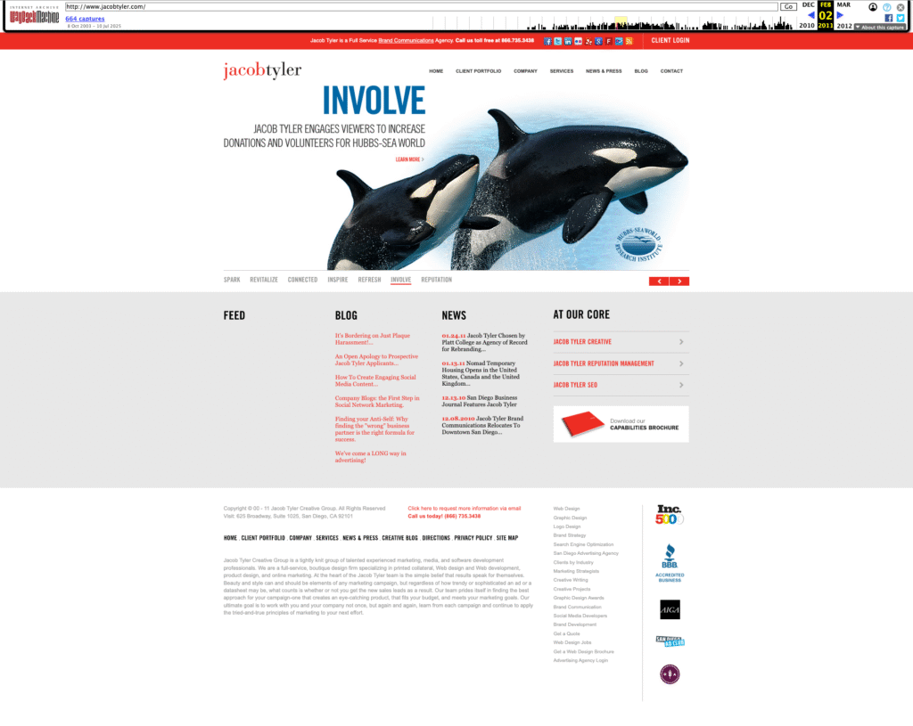
The Web Design Evolution of Jacob Tyler: A Digital Timeline Spanning Two Decades

Well… we did it. We launched a new website. You know how the old business saying goes; “We’re our own worst client”. That’s true for many and very true for us. We seem to always put ourselves last in the “to-do list” pecking order. However, after months of work, back-and-forth, opinions, changes, and procrastination, we have created an experience that we feel works for us AND the people visiting. In other words, this is yet another Web design we are proud of. We (our team) have a saying that websites are like dog years—every year online is equivalent to seven years in technology evolution. It’s a playful metaphor that captures a serious truth about digital longevity in our rapidly changing industry. Yet despite this accelerated aging, both our own websites and those we create for clients have consistently defied the odds, averaging an impressive eight-year lifespan that speaks to thoughtful design and strategic planning.

Today, we’re taking a journey through our own digital evolution, examining how our website has transformed over the years and what these changes reveal about broader trends in web design, user behavior, and technological advancement.

Version 1: The Foundation Years (Early 2000s)

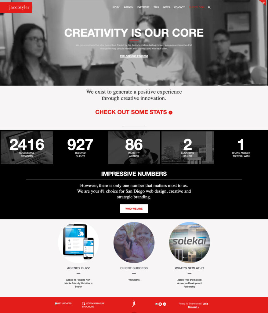
Our first website was a product of its time—clean, corporate, and information-focused. The design featured our signature red branding with a structured layout that prioritized content hierarchy and professional presentation. Navigation was straightforward, with clear sections for services, portfolio, and contact information.

This early iteration reflected the web standards of the early 2000s: fixed-width layouts, table-based structures, and a desktop-first mentality. Users were patient with longer load times and comfortable with scrolling through dense information.


Key characteristics of Version 1:

  • Static, information-rich design
  • Desktop-only optimization
  • Traditional corporate aesthetic
  • Content-heavy approach
  • Clear service differentiation

Version 2: The Interactive Revolution

Our second go-around was a total game-changer (at least to us). We ditched the static, corporate look and went big—think larger images, video content (super high-tech at the time), and interactive stuff that actually made people feel something when they landed on our site. Instead of just showing our work like a boring gallery, our case studies started telling real stories with visuals that packed a punch.

This was right when everyone was really getting overly obsessed with Facebook and Instagram (just getting started), and suddenly every brand needed to be a storyteller. So we flipped the script on how we presented our portfolio. Instead of just saying “Hey, look what we made,” we started showing “Here’s how our creative work actually moved the needle for our clients.” We stopped being an information dump and started creating experiences that people actually wanted to stick around for.

Notable improvements in Version 2:

  • Enhanced visual storytelling
  • Interactive portfolio elements and video
  • Stronger emotional connection
  • Social media integration
  • Results-focused case studies

Version 3: Mobile-First Thinking

The third generation of our website represented our adaptation to the mobile revolution. As smartphones and tablets became ubiquitous, we redesigned with responsive principles at the core. The layout became more flexible, typography scaled appropriately across devices, and navigation transformed to accommodate touch interfaces. At the time, everyone was asking us who designed from mobile phones. And of course, this is extremely important however, a lot of companies that we work with, including us actually have less views on mobile platforms even to this day. That’s because in the business to business environment, many people are doing their research on their laptops and desktop devices.

Also, suddenly, scrolling became natural—people were swiping and scrolling with their thumbs all day long. Mobile screens were small, so longer pages made more sense than trying to cram everything into tiny viewports. That became the norm for desktop as well.

This was also when we started playing around with all the shiny new web tech and jumped on trends like parallax scrolling and those tiny animations that make everything feel more alive. We even spent some time wondering if we should design for the Apple Watch—yeah, that was a thing for about five minutes. Looking back, it’s a good reminder that just because something’s new and buzzy doesn’t mean you need to go all-in, but it’s still worth checking out to see if it’s actually useful or just another flash in the pan.

The mobile-first approach fundamentally changed how we structured content:

  • Responsive design principles
  • Touch-friendly navigation
  • Optimized loading speeds
  • Progressive enhancement
  • Cross-platform compatibility

Version 4: The Current Era – Bold, Creative, and Results-Driven

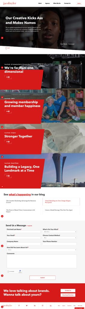
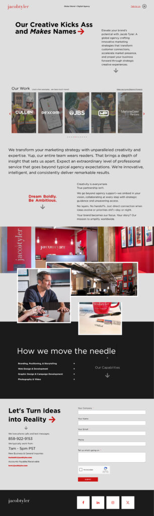
Our latest website embodies everything we’ve learned about effective digital experiences. The tagline “Our Creative Kicks Ass and Makes Names” was the only copy that stayed from the previous website because it immediately establishes our confident, results-oriented approach while maintaining the professional credibility our global clients expect.

The current design features:

  • Bold Visual Hierarchy: Large typography and strategic use of white space guide users through our story
  • Integrated Case Studies: Portfolio pieces are woven throughout the experience.
  • Multi-Device Optimization: Seamless experiences across desktop, tablet, and mobile devices
  • Performance Focus: Fast loading times and smooth interactions enhance user engagement
  • Conversion-Oriented: Strategic placement of contact forms and calls-to-action drive business results

The Importance of Strategic Redesign

Each evolution of our website wasn’t driven by boredom or aesthetic trends—it responded to fundamental shifts in user behavior, technology capabilities, and business objectives. This strategic approach to redesign offers several key benefits:

Technological Relevance

Keeping pace with web standards, security protocols, and performance expectations ensures your site remains functional and trustworthy.

User Experience Evolution

As user expectations change, websites must adapt to meet new interaction patterns and consumption preferences.

Brand Maturation

Your digital presence should evolve alongside your business, reflecting growth, expanded capabilities, and refined positioning.

Competitive Advantage

Regular updates help maintain differentiation in increasingly crowded markets.

Search Engine Optimization

Fresh content, improved site structure, and modern technical implementation boost search visibility.

Lessons from Our Journey

Our two-decade website evolution offers several insights for businesses considering their own digital transformation:

1. Plan for Longevity: While we joke about dog years, our eight-year average lifespan proves that thoughtful design and solid technical foundation can extend website value significantly.

2. Embrace Change Gradually: Each iteration built upon previous successes rather than starting from scratch, ensuring continuity while enabling innovation.

3. User-Centric Design Wins: Our most successful redesigns prioritized user needs over internal preferences or fleeting design trends. This applies for our clients as well.

4. Technology Should Enable, Not Drive: We adopted new technologies when they enhanced user experience, not simply because they existed.

5. Content Strategy Matters: Effective websites balance engaging presentation with substantial, valuable content that serves user intent.

Looking Forward

As we continue evolving our online presence, we’re already anticipating the next wave of changes: voice interfaces, AI-powered personalization, generative search, and immersive technologies that will reshape how users interact with brands online.

But regardless of technological advancement, our core philosophy remains constant: create experiences that connect with users, drive business results, and stand the test of time. After all, in an industry where dog years apply, longevity is the ultimate measure of success.

The Jacob Tyler website journey demonstrates that strategic redesign isn’t about chasing trends—it’s about thoughtfully evolving to serve users better while achieving business objectives. Whether you’re considering your first major redesign or your fourth, remember that the best websites aren’t just built to impress today’s visitors, but to adapt and thrive for years to come.

Ready to discuss how your website design can evolve to meet changing user expectations and business goals? Let’s start that conversation.

Why User Experience Design Services Drive Better Conversions

A well-designed UI can boost conversion rates by up to 200%, and a comprehensive UX strategy can raise that to 400%. This isn’t marketing hyperbole—it’s the measurable reality of what happens when companies partner with a brand experience agency that understands the intricate relationship between user psychology, design strategy, and business outcomes.

We’ve witnessed this transformation firsthand across dozens of client engagements. When a mid-market SaaS company approached us with a 1.2% conversion rate and users abandoning their onboarding flow, we didn’t just redesign their interface. We rebuilt their entire user journey from the ground up, resulting in a 340% conversion lift within eight weeks of launch.

The data is clear: 88% of consumers won’t return to a website after a frustrating experience, while every $1 invested in UX results in a return of $100 (ROI = 9,900%). For businesses seeking competitive advantage, user experience design isn’t optional—it’s the difference between market leaders and market followers.

The Science Behind UX-Driven Conversions

User experience operates on psychological principles that directly influence decision-making behavior. First impressions happen within 50 milliseconds, and nearly 94% of those impressions are based on design. This split-second judgment determines whether users engage deeper or abandon immediately.

The conversion impact extends far beyond aesthetics. A 1-second delay in page response can lead to a 7% decrease in conversions, while 53% of mobile users abandon a website if it takes longer than three seconds to load. Speed, clarity, and intuitive navigation create the foundation for conversion optimization.

Consider the mobile experience specifically. 50% of e-commerce revenue is generated from mobile devices, and 60% of online shoppers exclusively use mobile devices to make shopping decisions. Yet 66% of mobile sites place tappable elements too close to each other, and 32% of sites have tappable elements that are too small—fundamental UX failures that directly harm conversion potential.

The Psychology of User Behavior

75% of users judge a website’s credibility based on its aesthetics, demonstrating how visual design influences trust and purchasing decisions. This credibility assessment happens before users even engage with content or evaluate product features.

Personalization amplifies this effect significantly. 74% of users feel frustrated when website content is not personalized, while 60% of consumers report that they will become repeat buyers after a personalized purchasing experience. A strategic brand experience agency leverages these insights to create tailored user journeys that guide prospects toward conversion.

Strategic UX Elements That Drive Conversions

Navigation and Information Architecture

94% of users cite straightforward navigation as a paramount factor in their website experience. We structure navigation hierarchies that match user mental models, reducing cognitive load and eliminating decision paralysis.

Clear information architecture prevents the confusion that kills conversions. Confusion kills conversions—a principle we apply across every touchpoint, from homepage messaging to checkout flows.

Mobile-First Design Strategy

74% of visitors are more likely to come back to a site with good mobile UX, and 90% of smartphone users claim they’re more likely to continue shopping if the user experience is great for them. Mobile optimization isn’t responsive design—it’s designing specifically for mobile behaviors and contexts.

We prioritize touch-friendly interfaces, thumb-zone optimization, and streamlined mobile conversion funnels. 85% of adults think that a company’s mobile website should be as good or better than their desktop website, setting the expectation bar for mobile experience quality.

Loading Speed and Performance

If a website takes more than three seconds to load, 40% of the people will leave that site. Performance optimization becomes a conversion strategy, not just a technical requirement.

Bounce rates increase by 123% if page loading time becomes more than one second. We implement performance budgets, optimize critical rendering paths, and prioritize above-the-fold content to ensure immediate engagement.

Measuring UX Impact on Business Outcomes

Conversion Rate Optimization

The relationship between UX improvements and conversion rates is measurable and repeatable. Forrester Research reported that a well-thought-out, frictionless UX design could potentially raise conversion rates up to 400%.

We track conversion improvements across multiple dimensions:

Micro-conversions: Email signups, demo requests, content downloads

Macro-conversions: Purchases, subscriptions, qualified leads

Behavioral metrics: Session duration, pages per visit, return visitor rates

Customer Retention and Lifetime Value

Companies that put in the work to improve customer experience see a 42% improvement in customer retention, a 33% improvement in customer satisfaction, and a 32% increase in cross-selling and up-selling.

The compound effect extends beyond initial conversions. 86% of consumers are willing to pay more for a better customer experience, directly impacting average order value and customer lifetime value.

Revenue Impact

According to Human Factors International, Staples increased their online revenue by 500% after its UX-focused site redesign. These aren’t isolated success stories—they represent the systematic application of user-centered design principles.

Businesses lose 35% of sales due to bad UX, translating to roughly $1.4 trillion in lost revenue. The opportunity cost of poor user experience extends across entire industries.

The Brand Experience Agency Advantage

Working with a specialized brand experience agency provides strategic advantages that internal teams often lack. We bring cross-industry insights, proven methodologies, and objective perspective to user experience challenges.

Our approach integrates brand strategy with conversion optimization. Rather than treating UX as a purely functional discipline, we align user experience with brand positioning and business objectives. This holistic perspective ensures that conversion improvements support long-term brand equity and customer relationships.

Research-Driven Design Decisions

We conduct user research, analyze behavioral data, and test design hypotheses before implementation. A/B tests on emails see 37% higher conversion rates than those that don’t—a principle we apply across all user experience touchpoints.

Our research methodology includes:

User interviews to understand motivations and pain points

Usability testing to identify friction in conversion funnels

Analytics analysis to uncover behavioral patterns and opportunities

Competitive benchmarking to identify industry best practices

Technology Integration

Successful AI-driven personalization initiatives result in a 20% increase in customer satisfaction, sales conversion rates, and employee engagement. We leverage technology to create personalized experiences at scale while maintaining human-centered design principles.

Advanced personalization, dynamic content optimization, and predictive user interfaces become competitive advantages when implemented strategically.

Common UX Mistakes That Harm Conversions

Checkout Process Complexity

Nearly 80% of surveyed U.S. and U.K. shoppers said they would abandon their online shopping carts if the checkout process is too cumbersome. Checkout optimization alone can recover significant revenue for e-commerce businesses.

Over 20% of shoppers have given up on purchases due to the requirement to create an account. Guest checkout options and progressive registration reduce friction while maintaining conversion momentum.

Poor Call-to-Action Strategy

Over 70% of small businesses neglect to incorporate call-to-action (CTA) buttons on their websites. Clear, compelling CTAs guide users toward desired actions and eliminate decision ambiguity.

We design CTAs that combine visual prominence with persuasive copy, positioning them strategically throughout the user journey to capture intent at multiple touchpoints.

Neglecting User Feedback

86% of consumers will leave a brand they trusted after only two poor customer experiences. Continuous user feedback collection and rapid iteration prevent small issues from becoming significant conversion barriers.

3% of customers will tell 15 or more people about their bad experiences, while 72% will tell 6 or more people about good experiences. User experience quality directly impacts word-of-mouth marketing and brand reputation.

Future-Proofing Your Conversion Strategy

Emerging Technologies

AI-powered chat tools saw the most significant uptick in downloads globally among all app genres in 2024, indicating growing user acceptance of AI-driven interfaces. We integrate conversational AI and chatbot experiences that enhance rather than replace human interaction.

Voice interfaces and augmented reality experiences represent emerging conversion opportunities. Early adoption of these technologies creates competitive differentiation while improving user engagement.

Accessibility and Inclusive Design

Accessible design isn’t just compliance—it’s conversion optimization for broader audiences. We implement inclusive design principles that improve usability for all users while expanding market reach.

Screen reader compatibility, keyboard navigation, and appropriate color contrast create better experiences for users with disabilities while often improving overall usability metrics.

Ready to turn every interaction into a conversion opportunity? Partner with our brand experience agency to design data-driven user experiences that drive measurable business growth.

FAQ Section

How quickly can UX improvements impact conversion rates?

A 1-second delay in page response can lead to a 7% decrease in conversions, showing UX improvements can impact results immediately. However, comprehensive UX optimization typically delivers measurable conversion gains within 4–8 weeks. Establishing baseline metrics before optimization helps accurately track ROI and performance improvements over time.

What’s the difference between UI and UX in terms of conversion impact?

A well-designed UI can increase conversions by up to 200%, while a comprehensive UX strategy can raise that number to 400%. UI (User Interface) focuses on visual and interactive design, while UX (User Experience) addresses the entire customer journey—research, navigation, emotional response, and satisfaction. Together, they create seamless experiences that turn visitors into loyal customers.

How do you measure the ROI of UX design services?

Every $1 invested in UX yields $100 in return (ROI = 9,900%). We measure UX ROI using metrics such as conversion rate growth, customer lifetime value, acquisition cost reduction, and support cost savings. Establishing benchmarks before implementation ensures clear visibility into the financial impact of UX improvements.

The Essentials of Brand Copywriting That Shapes Customer Perception

Why Your Logo is a Cornerstone of Your Brand

A logo is more than just a symbol; it’s the face of your brand. It establishes your brand identity design and builds a connection with your audience. A strong logo helps people recognize and remember your brand, creating trust and loyalty over time.

By using thoughtful logo design, you can create brand resonance. This means your logo aligns with your audience’s values and emotions, helping them feel a deeper connection to your brand.

Start with Audience Research

Why Knowing Your Audience Matters

Understanding your audience is the first step in designing a logo that resonates. Without knowing who your customers are, it’s nearly impossible to create an audience-centric design that speaks to their needs.

Think about these questions as you begin:

  • Who are your customers?
  • What are their preferences, values, and challenges?
  • How should they feel when they see your logo?

Gather Key Insights

Take time to understand your target market:

  • Demographics: Consider age, location, and gender.
  • Behaviors: What problems do they need solutions for?
  • Values: What motivates them to trust a brand?

These insights help ensure your logo reflects the values and tone your audience expects.

Principles of Effective Logo Design

Keep It Simple

Simplicity ensures that your logo is memorable and versatile. Avoid unnecessary details that make your logo hard to recognize. A clean, simple design works better across multiple platforms and sizes.

Relevance is Essential

Your logo must fit your industry and audience. For example:

  • A tech company might use sleek, geometric designs.
  • A brand targeting children might feature playful shapes and colors.

Focus on Scalability

Your logo should remain clear and impactful no matter where it appears, whether it’s on a business card, a website, or a large billboard. This requires simplicity in design and attention to detail. Avoid intricate patterns or overly detailed elements that might blur or lose clarity when scaled down.

Test your logo at various sizes to ensure all elements are legible. For digital formats, check how it looks on mobile screens versus desktops. For physical applications, such as signage or promotional items, ensure the logo maintains its integrity and visual appeal across different printing methods.

Scalability ensures your logo is versatile and effective, helping your brand maintain a consistent identity across every platform and medium.

Prioritize Timelessness

Trendy designs may look good now but risk becoming outdated, leaving your brand feeling irrelevant over time. Instead, focus on creating a logo with classic design elements that won’t lose their appeal. Clean typography, balanced layouts, and simple shapes are the foundation of a timeless logo.

Timeless logos are also easier to adapt to future branding needs without requiring a full redesign. Think of iconic logos like Coca-Cola or FedEx—these designs remain effective because they emphasize simplicity and clarity rather than fleeting trends. By prioritizing longevity, you ensure your logo continues to resonate with your audience for years to come.

Steps to Create a Logo That Speaks to Your Audience

Define Your Brand

Your brand’s story is the foundation of your logo design. Think about:

  • Your mission and vision.
  • The values you want to communicate.
  • The emotions you want your audience to feel.

Brainstorm Ideas

Explore logo design inspiration from your industry, competitors, and even unrelated fields. Sketch out rough ideas, experiment with different layouts, and start thinking about elements like colors and typography.

Choose Key Elements

Choosing the right elements for your logo is essential to creating a design that aligns with your brand’s personality and resonates with your audience.

Colors play a vital role in setting the tone of your logo. Blue conveys trust and reliability, making it a popular choice for finance or tech brands. Green suggests sustainability and growth, ideal for eco-friendly or wellness-focused businesses. The colors you choose should reflect the emotions and values you want your audience to associate with your brand.

Typography is another critical element. Fonts can communicate your brand’s personality at a glance. Serif fonts feel traditional and professional, making them suitable for industries like law or education. Sans-serif fonts, on the other hand, are modern and approachable, perfect for tech startups or creative companies. Your font choice should support the overall message of your brand.

Shapes and symbols add a visual dimension that reinforces your message. Clean geometric shapes, like circles, convey unity and friendliness, while angular shapes suggest strength and innovation. Custom illustrations can also enhance your logo’s uniqueness and help it stand out. These visual elements should complement the overall design and align with your brand’s values and goals.

Refine and Test

Review your design, simplify where needed, and get feedback from others. Test your logo in real-world scenarios, like on websites, business cards, and merchandise.

Common Pitfalls to Avoid

Overcomplicating Your Design

Too many details can make your logo hard to recognize, especially at smaller sizes. A cluttered design dilutes your brand message and reduces memorability. Keep it simple and focused to ensure clarity and impact.

Ignoring Scalability

Your logo must work well in both large and small formats. Test it across multiple sizes to confirm all elements remain legible and visually appealing. Scalability ensures your logo is effective on everything from a website favicon to a billboard.

Following Trends Too Closely

While it’s important to stay relevant, relying too heavily on trends can make your logo feel outdated quickly. Instead, focus on timeless elements like clean typography and balanced layouts that maintain their appeal over time.

Forgetting the Audience

Your logo should resonate with your audience, not just reflect personal design preferences. Always prioritize what your target market values and expects from your brand to create a meaningful connection.

Using Emotional Branding to Build Connections

The Psychology of Design

The elements of design—colors, shapes, and fonts—strongly influence how your audience feels about your brand. Colors, for example, evoke specific emotions and associations. Warm tones like red and orange create feelings of energy and excitement, while cooler shades such as blue and green inspire trust and calmness. This is why blue and green are often used by industries like finance and healthcare.

Shapes also carry emotional weight. Circular designs can symbolize unity and friendliness, making them ideal for brands that want to emphasize inclusivity. In contrast, angular shapes convey strength and innovation, which are qualities often associated with technology and engineering companies. Typography, meanwhile, influences how your brand is perceived. Sleek, bold fonts suggest modernity and confidence, while softer, more rounded typefaces feel approachable and friendly.

By choosing the right colors, shapes, and fonts that match your brand’s message, you can create a logo that connects with your audience. Every design element should work together to tell your story, build trust, and reinforce the values your brand represents.

Reinforce Your Brand’s Story

Your logo should tell a story. For example, if sustainability is a core value, use natural colors and organic shapes. For an innovative tech company, sleek lines and bold typography reinforce your message.

Build Trust and Loyalty

A well-designed logo creates an emotional bond with your audience. This helps them connect with your brand on a deeper level, encouraging trust and loyalty over time.

Bringing Your Vision to Life

Designing a logo that resonates requires more than creativity—it demands strategy and insight. By focusing on your audience and following design principles, you can create a logo that stands out and connects on an emotional level.

If you’re ready to elevate your brand identity design with professional logo design services, Jacob Tyler is here to help. Visit our branding expertise page to learn how we create designs that inspire and connect.

Signs It’s Time for a Website Redesign: Staying Competitive in the Digital Age

The Importance of a Modern, Well-Optimized Website

If your website is slow, hard to navigate, or looks outdated, you’re losing potential customers—fast. Visitors expect a seamless experience, and if your site doesn’t deliver, they’ll leave and head straight to a competitor. A poor website can damage your brand’s credibility, lower search rankings, and hurt conversions.

In today’s digital world, an outdated site isn’t just an inconvenience—it’s a liability. Investing in a website redesign ensures your business stays competitive with a modern, user-friendly, and high-performing website.

Your Website Looks Outdated and Unprofessional

First impressions are everything. When visitors land on your site, they immediately judge your credibility based on design, layout, and usability. If your website appears outdated, users may assume your business is untrustworthy or irrelevant.

Common Signs of an Outdated Website:

  • Cluttered layouts that make navigation difficult – A messy, unorganized website overwhelms visitors and makes it hard to find important information. If users struggle to locate what they need, they’ll leave and seek out a competitor with a cleaner, more intuitive design.

  • Unresponsive design that doesn’t adapt to different screen sizes – Today’s users access websites from a variety of devices, including smartphones, tablets, and desktops. If your website isn’t mobile-friendly, it can lead to distorted images, misplaced text, and frustrating navigation, causing visitors to leave.

  • Outdated typography and color schemes that don’t reflect modern branding – Fonts that are difficult to read or color schemes that feel dull or mismatched can make your website seem outdated and unprofessional. Modern, well-chosen typography and colors create a visually appealing experience that keeps users engaged.

Color psychology in UI plays a key role in user engagement. The right colors can evoke trust, excitement, or a sense of professionalism, depending on the brand’s goals. A fresh visual identity with modern color schemes not only enhances your brand’s perception but also encourages visitors to stay longer and take action, leading to higher conversions.

Poor User Experience (UX) and Navigation Issues

A frustrating website experience drives users away. Today’s internet users expect speed, clarity, and ease of use when navigating a site. If they struggle to find what they need or encounter delays, they are likely to leave and never return. A poor user experience (UX) not only frustrates visitors but also reduces conversions and damages your brand’s credibility.

Signs of Poor UX:

  • Slow loading times that frustrate users – In an era where attention spans are short, even a few seconds of delay can lead to lost traffic. A slow website can be caused by large, unoptimized images, outdated code, or too many third-party scripts running in the background.

  • Complicated navigation that makes it hard to find information – If users have to click through multiple pages or search endlessly for essential details, they will likely abandon your site. Designing intuitive navigation ensures that users can easily access the information they need with minimal effort, improving engagement and reducing bounce rates.

  • Lack of mobile responsiveness, causing a poor experience on smaller screens – More than half of web traffic comes from mobile devices, and a website that isn’t optimized for mobile can drive users away. Issues like distorted layouts, hard-to-click buttons, and slow load times on mobile make it difficult for visitors to interact with your content. A mobile-responsive website design adapts seamlessly to different screen sizes, ensuring a smooth experience across all devices.

Improving UX through professional website updates can keep visitors engaged, encourage conversions, and enhance overall satisfaction. A well-structured layout with clear navigation and fast performance makes it easy for users to explore your site effortlessly.

Your Website is Not Mobile-Responsive

With most web traffic coming from mobile devices, having a website that isn’t mobile-friendly can significantly hurt your business. Users expect a seamless experience regardless of the device they’re using, and if your site doesn’t adapt properly, they’ll leave and look elsewhere. Additionally, Google prioritizes mobile-friendly websites in search rankings, meaning poor mobile optimization can lower your visibility and reduce organic traffic.

Signs Your Website Isn’t Mobile-Friendly:

  • Text and images that don’t scale properly – If users have to zoom in to read text or scroll sideways to view content, your site isn’t optimized for mobile. A responsive design automatically adjusts elements for different screen sizes.

  • Slow loading pages that cause users to exit quickly – Mobile users expect fast load times. If your website takes too long to load, visitors will leave before interacting with your content, leading to higher bounce rates and fewer conversions.

  • Buttons and links that are difficult to tap – Navigation should be easy on a touchscreen. If buttons are too small or links are placed too close together, users may struggle to click on them, leading to frustration and a poor experience.

A mobile-responsive website design ensures your site adjusts seamlessly to all screen sizes, providing a smooth browsing experience. This not only enhances usability but also improves SEO performance, helping your website rank higher and attract more visitors.

Slow Website Speed and Poor Performance

Users expect fast-loading websites, and even a slight delay can cause frustration. A slow site leads to high bounce rates, lower conversions, and poor search rankings. Visitors won’t wait for a sluggish website to load—they’ll move on to a competitor with a faster, more efficient site.

Common Causes of Slow Performance:

  • Outdated website architecture – Older websites often have inefficient code and outdated frameworks that slow down performance. Regular updates and modern development practices can significantly improve speed.

  • Excessive use of plugins – Too many third-party plugins can bog down your site, increasing load times. Streamlining and removing unnecessary plugins can enhance efficiency.

  • Large, unoptimized images – High-resolution images that aren’t properly compressed can drastically slow down page speed. Optimizing images for web use ensures a balance between quality and performance.

Improving website speed enhances user satisfaction and increases engagement. One effective way to achieve this is by incorporating white space in web design. A clean, uncluttered layout improves readability, directs user focus, and helps optimize load speed by reducing unnecessary elements that can slow down your site.

Your Website Isn’t Generating Leads or Conversions

A successful website doesn’t just attract visitors—it converts them into customers. If your site isn’t generating inquiries, leads, or sales, the design may be failing to guide users toward taking action. Every element of your website should support the user journey, making it easy for visitors to engage with your brand and complete desired actions, such as filling out a contact form or making a purchase.

Common Issues Impacting Conversions:

  • Weak or unclear calls-to-action (CTAs) – If visitors don’t know what step to take next, they won’t take any action at all. CTAs should be clear, compelling, and strategically placed to guide users toward signing up, requesting a quote, or making a purchase.

  • Poorly placed lead capture forms – Contact forms and lead generation forms should be easy to find and simple to fill out. If they’re too long, hidden in hard-to-reach places, or ask for too much information, users are likely to abandon them.

  • Hard-to-navigate checkout processes (for eCommerce) – If completing a purchase requires too many steps or the process feels confusing, customers will leave before finalizing their transaction. A streamlined, user-friendly checkout experience can significantly improve sales.

A corporate website redesign solution can address these issues by optimizing CTAs, improving landing pages, and refining form placements. With a more intuitive design and smoother user experience, your website can better engage visitors and drive conversions.

SEO Performance is Suffering

If your website isn’t ranking well on search engines, you’re missing out on valuable traffic and potential customers. Google prioritizes websites that load quickly, are mobile-friendly, and have a well-organized structure. If your site doesn’t meet these criteria, it will struggle to appear in search results, making it harder for users to find your business online.

Common SEO Issues:

  • Disorganized site structure and broken links – A poorly structured website confuses both users and search engines. If important pages are buried or links are broken, Google will struggle to index your site properly.
  • Slow page speeds that hurt user experience – Search engines favor websites that load quickly. If your site is sluggish, it can negatively impact your ranking and push users away.
  • Lack of mobile optimization – With more users browsing on smartphones, a website that doesn’t adjust properly for smaller screens won’t just frustrate visitors—it will also rank lower in search results.

An SEO-optimized website redesign improves search rankings, increases organic traffic, and enhances visibility. Pairing this with digital marketing strategies ensures your website reaches the right audience and stays ahead of competitors.

Your Business Has Evolved, But Your Website Hasn’t

As businesses grow, their products, services, and branding evolve. If your website doesn’t reflect these updates, it can create confusion for visitors and fail to represent your brand accurately.

Signs Your Website No Longer Represents Your Business:

  • New services or products are missing – If you’ve expanded your offerings but haven’t updated your website, potential customers won’t know what you provide.
  • Branding changes aren’t reflected in the design – If your company has undergone a rebrand, your website should match your current visual identity, including colors, typography, and logo.
  • Messaging is inconsistent with your current goals – Your website should communicate your latest value proposition clearly. If your content is outdated or misaligned with your company’s direction, visitors may not understand what you offer.

A strong brand development strategy ensures that your website accurately represents your business today. Updating company/product naming, marketing strategy, and logo design enhances credibility and builds trust with your audience.

Competitive Pressure: Your Competitors Have Better Websites

If your competitors have a modern, user-friendly website, they’re more likely to attract and convert customers. An outdated website can make your business appear less professional and drive potential clients to competitors who offer a better digital experience.

How an Outdated Website Hurts Your Business:

  • Creates a poor first impression – If your site looks outdated or unprofessional, visitors may assume your business is not up to industry standards.
  • Ranks lower in search results – A poorly optimized website won’t perform well in search engines, making it harder for new customers to find you.
  • Leads to high bounce rates – If users struggle to navigate your site or find the information they need, they will leave quickly and look elsewhere.

Learning the key elements of modern website design can help you stay ahead. Investing in competitive web design strategies ensures your website remains engaging, relevant, and optimized for success.

The Importance of a Future-Proof Website

Technology and user expectations evolve rapidly. A future-proof website is designed to adapt to these changes, ensuring long-term functionality and relevance.

Features of a Future-Proof Website:

  • Scalable infrastructure to support business growth – Your website should be able to grow as your company expands, without needing constant major updates.
  • A flexible content management system (CMS) for easy updates – A user-friendly CMS allows you to make content changes quickly without needing technical expertise.
  • Integration capabilities for emerging technologies – A well-built website should be able to integrate with new tools, platforms, and digital marketing strategies as they evolve.

A proactive approach to enhancing website performance ensures your site remains competitive and efficient. Businesses that incorporate eCommerce, video production, and mobile applications into their web presence stay ahead of industry trends.

A strong online presence is essential for business success. If your website shows any of these signs, it’s time for a website redesign.

Jacob Tyler specializes in website redesign services, improving usability, performance, and SEO. Our team creates modern, high-performing websites that drive results.

Contact Jacob Tyler today to discuss how we can transform your website into a powerful business tool.

Balancing Aesthetics and Functionality in Website Redesigns

Why Your Logo is a Cornerstone of Your Brand

A logo is more than just a symbol; it’s the face of your brand. It establishes your brand identity design and builds a connection with your audience. A strong logo helps people recognize and remember your brand, creating trust and loyalty over time.

By using thoughtful logo design, you can create brand resonance. This means your logo aligns with your audience’s values and emotions, helping them feel a deeper connection to your brand.

Start with Audience Research

Why Knowing Your Audience Matters

Understanding your audience is the first step in designing a logo that resonates. Without knowing who your customers are, it’s nearly impossible to create an audience-centric design that speaks to their needs.

Think about these questions as you begin:

  • Who are your customers?
  • What are their preferences, values, and challenges?
  • How should they feel when they see your logo?

Gather Key Insights

Take time to understand your target market:

  • Demographics: Consider age, location, and gender.
  • Behaviors: What problems do they need solutions for?
  • Values: What motivates them to trust a brand?

These insights help ensure your logo reflects the values and tone your audience expects.

Principles of Effective Logo Design

Keep It Simple

Simplicity ensures that your logo is memorable and versatile. Avoid unnecessary details that make your logo hard to recognize. A clean, simple design works better across multiple platforms and sizes.

Relevance is Essential

Your logo must fit your industry and audience. For example:

  • A tech company might use sleek, geometric designs.
  • A brand targeting children might feature playful shapes and colors.

Focus on Scalability

Your logo should remain clear and impactful no matter where it appears, whether it’s on a business card, a website, or a large billboard. This requires simplicity in design and attention to detail. Avoid intricate patterns or overly detailed elements that might blur or lose clarity when scaled down.

Test your logo at various sizes to ensure all elements are legible. For digital formats, check how it looks on mobile screens versus desktops. For physical applications, such as signage or promotional items, ensure the logo maintains its integrity and visual appeal across different printing methods.

Scalability ensures your logo is versatile and effective, helping your brand maintain a consistent identity across every platform and medium.

Prioritize Timelessness

Trendy designs may look good now but risk becoming outdated, leaving your brand feeling irrelevant over time. Instead, focus on creating a logo with classic design elements that won’t lose their appeal. Clean typography, balanced layouts, and simple shapes are the foundation of a timeless logo.

Timeless logos are also easier to adapt to future branding needs without requiring a full redesign. Think of iconic logos like Coca-Cola or FedEx—these designs remain effective because they emphasize simplicity and clarity rather than fleeting trends. By prioritizing longevity, you ensure your logo continues to resonate with your audience for years to come.

Steps to Create a Logo That Speaks to Your Audience

Define Your Brand

Your brand’s story is the foundation of your logo design. Think about:

  • Your mission and vision.
  • The values you want to communicate.
  • The emotions you want your audience to feel.

Brainstorm Ideas

Explore logo design inspiration from your industry, competitors, and even unrelated fields. Sketch out rough ideas, experiment with different layouts, and start thinking about elements like colors and typography.

Choose Key Elements

Choosing the right elements for your logo is essential to creating a design that aligns with your brand’s personality and resonates with your audience.

Colors play a vital role in setting the tone of your logo. Blue conveys trust and reliability, making it a popular choice for finance or tech brands. Green suggests sustainability and growth, ideal for eco-friendly or wellness-focused businesses. The colors you choose should reflect the emotions and values you want your audience to associate with your brand.

Typography is another critical element. Fonts can communicate your brand’s personality at a glance. Serif fonts feel traditional and professional, making them suitable for industries like law or education. Sans-serif fonts, on the other hand, are modern and approachable, perfect for tech startups or creative companies. Your font choice should support the overall message of your brand.

Shapes and symbols add a visual dimension that reinforces your message. Clean geometric shapes, like circles, convey unity and friendliness, while angular shapes suggest strength and innovation. Custom illustrations can also enhance your logo’s uniqueness and help it stand out. These visual elements should complement the overall design and align with your brand’s values and goals.

Refine and Test

Review your design, simplify where needed, and get feedback from others. Test your logo in real-world scenarios, like on websites, business cards, and merchandise.

Common Pitfalls to Avoid

Overcomplicating Your Design

Too many details can make your logo hard to recognize, especially at smaller sizes. A cluttered design dilutes your brand message and reduces memorability. Keep it simple and focused to ensure clarity and impact.

Ignoring Scalability

Your logo must work well in both large and small formats. Test it across multiple sizes to confirm all elements remain legible and visually appealing. Scalability ensures your logo is effective on everything from a website favicon to a billboard.

Following Trends Too Closely

While it’s important to stay relevant, relying too heavily on trends can make your logo feel outdated quickly. Instead, focus on timeless elements like clean typography and balanced layouts that maintain their appeal over time.

Forgetting the Audience

Your logo should resonate with your audience, not just reflect personal design preferences. Always prioritize what your target market values and expects from your brand to create a meaningful connection.

Using Emotional Branding to Build Connections

The Psychology of Design

The elements of design—colors, shapes, and fonts—strongly influence how your audience feels about your brand. Colors, for example, evoke specific emotions and associations. Warm tones like red and orange create feelings of energy and excitement, while cooler shades such as blue and green inspire trust and calmness. This is why blue and green are often used by industries like finance and healthcare.

Shapes also carry emotional weight. Circular designs can symbolize unity and friendliness, making them ideal for brands that want to emphasize inclusivity. In contrast, angular shapes convey strength and innovation, which are qualities often associated with technology and engineering companies. Typography, meanwhile, influences how your brand is perceived. Sleek, bold fonts suggest modernity and confidence, while softer, more rounded typefaces feel approachable and friendly.

By choosing the right colors, shapes, and fonts that match your brand’s message, you can create a logo that connects with your audience. Every design element should work together to tell your story, build trust, and reinforce the values your brand represents.

Reinforce Your Brand’s Story

Your logo should tell a story. For example, if sustainability is a core value, use natural colors and organic shapes. For an innovative tech company, sleek lines and bold typography reinforce your message.

Build Trust and Loyalty

A well-designed logo creates an emotional bond with your audience. This helps them connect with your brand on a deeper level, encouraging trust and loyalty over time.

Bringing Your Vision to Life

Designing a logo that resonates requires more than creativity—it demands strategy and insight. By focusing on your audience and following design principles, you can create a logo that stands out and connects on an emotional level.

If you’re ready to elevate your brand identity design with professional logo design services, Jacob Tyler is here to help. Visit our branding expertise page to learn how we create designs that inspire and connect.

Create a Logo that Connects Emotionally with Your Audience

Why Your Logo is a Cornerstone of Your Brand

A logo is more than just a symbol; it’s the face of your brand. It establishes your brand identity design and builds a connection with your audience. A strong logo helps people recognize and remember your brand, creating trust and loyalty over time.

By using thoughtful logo design, you can create brand resonance. This means your logo aligns with your audience’s values and emotions, helping them feel a deeper connection to your brand.

Start with Audience Research

Why Knowing Your Audience Matters

Understanding your audience is the first step in designing a logo that resonates. Without knowing who your customers are, it’s nearly impossible to create an audience-centric design that speaks to their needs.

Think about these questions as you begin:

  • Who are your customers?
  • What are their preferences, values, and challenges?
  • How should they feel when they see your logo?

Gather Key Insights

Take time to understand your target market:

  • Demographics: Consider age, location, and gender.
  • Behaviors: What problems do they need solutions for?
  • Values: What motivates them to trust a brand?

These insights help ensure your logo reflects the values and tone your audience expects.

Principles of Effective Logo Design

Keep It Simple

Simplicity ensures that your logo is memorable and versatile. Avoid unnecessary details that make your logo hard to recognize. A clean, simple design works better across multiple platforms and sizes.

Relevance is Essential

Your logo must fit your industry and audience. For example:

  • A tech company might use sleek, geometric designs.
  • A brand targeting children might feature playful shapes and colors.

Focus on Scalability

Your logo should remain clear and impactful no matter where it appears, whether it’s on a business card, a website, or a large billboard. This requires simplicity in design and attention to detail. Avoid intricate patterns or overly detailed elements that might blur or lose clarity when scaled down.

Test your logo at various sizes to ensure all elements are legible. For digital formats, check how it looks on mobile screens versus desktops. For physical applications, such as signage or promotional items, ensure the logo maintains its integrity and visual appeal across different printing methods.

Scalability ensures your logo is versatile and effective, helping your brand maintain a consistent identity across every platform and medium.

Prioritize Timelessness

Trendy designs may look good now but risk becoming outdated, leaving your brand feeling irrelevant over time. Instead, focus on creating a logo with classic design elements that won’t lose their appeal. Clean typography, balanced layouts, and simple shapes are the foundation of a timeless logo.

Timeless logos are also easier to adapt to future branding needs without requiring a full redesign. Think of iconic logos like Coca-Cola or FedEx—these designs remain effective because they emphasize simplicity and clarity rather than fleeting trends. By prioritizing longevity, you ensure your logo continues to resonate with your audience for years to come.

Steps to Create a Logo That Speaks to Your Audience

Define Your Brand

Your brand’s story is the foundation of your logo design. Think about:

  • Your mission and vision.
  • The values you want to communicate.
  • The emotions you want your audience to feel.

Brainstorm Ideas

Explore logo design inspiration from your industry, competitors, and even unrelated fields. Sketch out rough ideas, experiment with different layouts, and start thinking about elements like colors and typography.

Choose Key Elements

Choosing the right elements for your logo is essential to creating a design that aligns with your brand’s personality and resonates with your audience.

Colors play a vital role in setting the tone of your logo. Blue conveys trust and reliability, making it a popular choice for finance or tech brands. Green suggests sustainability and growth, ideal for eco-friendly or wellness-focused businesses. The colors you choose should reflect the emotions and values you want your audience to associate with your brand.

Typography is another critical element. Fonts can communicate your brand’s personality at a glance. Serif fonts feel traditional and professional, making them suitable for industries like law or education. Sans-serif fonts, on the other hand, are modern and approachable, perfect for tech startups or creative companies. Your font choice should support the overall message of your brand.

Shapes and symbols add a visual dimension that reinforces your message. Clean geometric shapes, like circles, convey unity and friendliness, while angular shapes suggest strength and innovation. Custom illustrations can also enhance your logo’s uniqueness and help it stand out. These visual elements should complement the overall design and align with your brand’s values and goals.

Refine and Test

Review your design, simplify where needed, and get feedback from others. Test your logo in real-world scenarios, like on websites, business cards, and merchandise.

Common Pitfalls to Avoid

Overcomplicating Your Design

Too many details can make your logo hard to recognize, especially at smaller sizes. A cluttered design dilutes your brand message and reduces memorability. Keep it simple and focused to ensure clarity and impact.

Ignoring Scalability

Your logo must work well in both large and small formats. Test it across multiple sizes to confirm all elements remain legible and visually appealing. Scalability ensures your logo is effective on everything from a website favicon to a billboard.

Following Trends Too Closely

While it’s important to stay relevant, relying too heavily on trends can make your logo feel outdated quickly. Instead, focus on timeless elements like clean typography and balanced layouts that maintain their appeal over time.

Forgetting the Audience

Your logo should resonate with your audience, not just reflect personal design preferences. Always prioritize what your target market values and expects from your brand to create a meaningful connection.

Using Emotional Branding to Build Connections

The Psychology of Design

The elements of design—colors, shapes, and fonts—strongly influence how your audience feels about your brand. Colors, for example, evoke specific emotions and associations. Warm tones like red and orange create feelings of energy and excitement, while cooler shades such as blue and green inspire trust and calmness. This is why blue and green are often used by industries like finance and healthcare.

Shapes also carry emotional weight. Circular designs can symbolize unity and friendliness, making them ideal for brands that want to emphasize inclusivity. In contrast, angular shapes convey strength and innovation, which are qualities often associated with technology and engineering companies. Typography, meanwhile, influences how your brand is perceived. Sleek, bold fonts suggest modernity and confidence, while softer, more rounded typefaces feel approachable and friendly.

By choosing the right colors, shapes, and fonts that match your brand’s message, you can create a logo that connects with your audience. Every design element should work together to tell your story, build trust, and reinforce the values your brand represents.

Reinforce Your Brand’s Story

Your logo should tell a story. For example, if sustainability is a core value, use natural colors and organic shapes. For an innovative tech company, sleek lines and bold typography reinforce your message.

Build Trust and Loyalty

A well-designed logo creates an emotional bond with your audience. This helps them connect with your brand on a deeper level, encouraging trust and loyalty over time.

Bringing Your Vision to Life

Designing a logo that resonates requires more than creativity—it demands strategy and insight. By focusing on your audience and following design principles, you can create a logo that stands out and connects on an emotional level.

If you’re ready to elevate your brand identity design with professional logo design services, Jacob Tyler is here to help. Visit our branding expertise page to learn how we create designs that inspire and connect.

The Impact of Color Psychology in UI Design

Why Color Is Critical in UI Design

Color is more than a design choice—it’s a strategic tool that directly affects how users interact with your website. It influences emotions, guides navigation, and creates a memorable agency brand identity. With thoughtful planning, color can enhance user experiences and support your business goals.

Each color triggers a different response. Blue builds trust, red inspires urgency, and green promotes calmness and growth. Designers use these associations to align visual elements with media planning and strategy, creating user-friendly designs that resonate with target audiences.

Consistency in color schemes across platforms is key to building recognition. Seeing familiar colors often builds trust. It makes your brand easier to remember. This helps your brand stand out in a competitive market.

Examples of Color Use in UI Design

  • Blue: Trusted by industries like healthcare and finance for its calming, reliable vibe.
  • Red: Commonly used in call-to-action buttons or sales banners to drive urgency.
  • Green: Perfect for eco-friendly brands or wellness sites to evoke balance and renewal.
  • Yellow: Inspires creativity and optimism, often used in youth-focused campaigns.

How Colors Influence Emotions and Actions

Psychological Effects of Colors

The psychological power of color can shape user actions. For example, red gives a feeling of urgency. This makes it great for online sales. On the other hand, green feels calm and soothing. This works well for wellness brands.

Designers carefully plan these emotional triggers to create the desired impact. Designers often analyze audience preferences and use data to refine color schemes. This method makes colors look nice and encourages actions, like clicking a button or signing up for a service.

Strategic Color Applications

  1. Use warm colors like red or orange for limited-time offers to drive immediate engagement.
  2. Apply cool tones like blue or purple for trust-based industries such as banking or technology.
  3. Incorporate green for wellness or sustainability-focused brands to foster feelings of renewal.

By aligning color choices with audience expectations, brands create interfaces that feel intuitive and approachable.

Building Brand Identity Through Color

Making an Impression with Color

Color plays a central role in establishing a strong brand identity. A consistent color palette helps users connect certain colors with your company. They will recognize these colors on your website, app, or ads. This recognition builds trust and loyalty over time.

For example, a tech company might use blue and gray to show innovation and reliability. A luxury brand could use gold and black to convey sophistication. These choices ensure that the visual identity reflects the company’s values and resonates with its audience.

Practical Tips for Choosing Brand Colors

  1. Reflect your values: Choose colors that represent your brand’s mission.
  2. Understand your audience: Research what appeals to your target demographic.
  3. Stay consistent: Use the same colors across platforms for a unified look.
  4. Test your palette: Experiment with color combinations to see what works best in real-world applications.

A well-planned color scheme, tied to a brand architecture framework, can strengthen customer relationships and make your marketing efforts more effective.

Colors as a Guide for Users

Enhancing Navigation and Clarit

Colors simplify navigation by directing users to key elements like menus, buttons, or calls to action. For example, a bright “Sign Up” button stands out on a plain background. This makes it easy for users to see and click on it.

Strategic color use also reduces cognitive load. When users encounter clear, consistent color schemes, they instinctively know where to focus their attention. This improves engagement and ensures a smoother user experience.

Designing for Usability

Accessibility is an essential consideration in UI design. High-contrast color schemes improve readability, making your website easy to use for individuals with visual impairments or color blindness. This inclusive approach enhances the overall experience and aligns with the principles of SEO-friendly website design.

For instance, designers might use dark text on light backgrounds to ensure clarity or rely on bold accent colors to highlight important actions. These decisions not only benefit accessibility but also support higher engagement metrics, such as time spent on the page.

Color in Media Strategies

Color as a Campaign Asset

Incorporating color psychology into media planning and strategy can significantly impact campaign performance. The right colors capture attention, evoke emotions, and make messages more memorable.

For example, bright, energetic colors like yellow or red can make a digital ad stand out in a crowded feed, while softer hues like pastels are better suited for creating calming, trust-based campaigns. By selecting colors that resonate with the audience, brands can amplify their message and improve conversion rates.

How to Use Color in Campaigns

  1. Highlight promotions or offers with bold colors.
  2. Balance bright accents with neutral tones to prevent visual clutter.
  3. Use consistent color schemes across ads and landing pages to build trust and familiarity.

This intentional approach ensures that color choices align with the campaign’s goals and audience preferences, driving better results across platforms.

Combining Copywriting and Color

The Role of Color in Messaging

Copywriting and color are two sides of the same coin when it comes to design. While copy communicates your message, color ensures that message gets noticed and remembered.

For example, a bold red headline catches attention. Soft background colors help make the text easier to read. This connection between color and text creates a smooth experience for users. It guides them through the content and encourages them to interact.

Using the right colors in your messaging improves your design and communication. This helps you get more engagement and better retention.

Designing for SEO and Engagement

How Color Impacts User Interaction

Colors influence how users navigate your site and how long they stay engaged. High-contrast colors make it easier to read and interact with content, while visually appealing designs encourage users to explore more pages. These behaviors send positive signals to search engines, boosting your site’s ranking.

For example, a well-designed landing page with a clear, color-coordinated layout can improve conversions and reduce bounce rates. This alignment of color with usability not only enhances the user experience but also supports your broader SEO goals.

Tips for Color-Driven Engagement

  1. Use complementary colors to create a harmonious design.
  2. Prioritize readability with high-contrast text and backgrounds.
  3. Test different palettes to identify what resonates most with your audience.

This thoughtful approach to design ensures that colors work as part of a cohesive strategy, strengthening your site’s performance and appeal.

For guidance on creating a visually engaging and functional design, contact Jacob Tyler today.

Designing Intuitive Navigation: A Guide to User-Friendly Menus

Imagine visiting a website and struggling to find what you need. Frustrating, right? Effective website navigation design ensures visitors can easily find information, improving user engagement and satisfaction. Whether you are building a new website or refining an existing one, a user-friendly navigation system is essential.

Understanding Website Navigation Design

Website navigation design organizes and presents links to help users find information quickly. It acts as the roadmap for your site, ensuring that visitors can effortlessly move from one section to another. A strong navigation design not only enhances user experience but also helps reduce bounce rates and increase time spent on the site.

A site with intuitive navigation encourages users to explore further and can lead to higher conversions. Additionally, search engines prioritize websites with clear, logical structures, boosting your SEO. For more insights, check out Best Practices for Designing the User Interface.

Principles of Designing Intuitive Navigation

Simplicity

Menus should be straightforward and use clear, concise labels. This prevents confusion and ensures users can find what they need quickly. Avoid clutter and unnecessary options that overwhelm visitors.

Consistency

Using the same navigation elements across all pages builds familiarity and trust. Consistency ensures users feel comfortable and confident as they navigate through the site.

Visibility

Make sure navigation menus are easy to find. Position them in standard locations, such as the top header or along the left side of the page. This ensures users won’t waste time searching for navigation tools.

Feedback

Interactive cues, such as highlighting the active link, help users understand where they are on your site. These small but impactful details make navigation seamless and satisfying.

Types of Navigation Menus

Horizontal Menus

These menus run across the top of the page and are ideal for showcasing primary sections. They are simple, intuitive, and effective for most websites.

Vertical Menus

Vertical menus are positioned along the side of the page. They work well for websites with many categories, allowing for a greater number of links without overwhelming the layout.

Dropdown Menus

Dropdown menus expand to reveal subcategories, making them excellent for organizing complex content. They save space while offering users quick access to nested pages.

For additional tips on improving usability, explore 6 eCommerce Best Practices for Better User Experience.

Hamburger Menus

A hamburger menu uses three stacked lines to indicate a hidden navigation menu. Commonly used in mobile design, it saves space while keeping menus accessible.

Best Practices for User-Friendly Navigation

  • Prioritize Content: Place the most important links at the top of your menu to guide users to key sections.
  • Use Descriptive Labels: Labels should clearly describe where the link will take users.
  • Limit Menu Items: Avoid overwhelming users by keeping the number of menu options manageable.
  • Responsive Design: Menus must work seamlessly on all devices, especially mobile, where most users browse.

For more inspiration, learn about The Art of User Experience Design Services.

Step-by-Step Guide to Creating Effective Navigation Menus

Step 1: Define the Website’s Structure

Start by mapping out your website’s content. Group related pages into categories and subcategories. A clear hierarchy will make it easier for users to understand your site’s organization.

Step 2: Choose the Appropriate Menu Style

Decide which menu type fits your website’s needs. A horizontal menu works well for simpler sites, while dropdown menus are better for sites with deeper structures.

Step 3: Design the Menu Layout

Arrange menu items logically, placing the most important ones at the beginning or end of the list. Use whitespace, colors, and fonts to make navigation visually appealing and easy to use.

Step 4: Test for Usability

Conduct user testing to see how real users interact with your menu. Observe how quickly they can find specific information and make adjustments based on feedback.

Step 5: Iterate and Improve

Navigation design is an ongoing process. Regularly review analytics to identify areas for improvement, such as high bounce rates or pages with low engagement.

Common Navigation Design Mistakes to Avoid

Overcomplicating the Menu

Too many options or nested submenus can confuse users. Keep it simple by limiting choices and focusing on key pages.

Using Ambiguous Labels

Vague or creative labels might look unique, but they can leave users guessing. Be clear and descriptive to improve usability.

Neglecting Mobile Optimization

With mobile traffic dominating the web, your menus must perform flawlessly on smaller screens. Test navigation on various devices to ensure a smooth experience.

Why Navigation Matters for Engagement

Intuitive navigation doesn’t just help users find information—it keeps them engaged. A seamless experience encourages visitors to explore your site further, increasing the likelihood of conversions. When users can effortlessly find what they need, they are more likely to trust your brand and return in the future.

How Jacob Tyler Can Help

If your website’s navigation isn’t meeting user expectations, it’s time to rethink your approach. Jacob Tyler specializes in creating user-friendly designs that improve user engagement and enhance overall experience. Learn more about our user experience design services and take the first step toward building a site that your visitors will love. Reach out to us today to make your website navigation more effective and engaging.

How Micro-Interactions Can Improve User Engagement

The smallest details can make the biggest impact on your website. A button that lights up, a subtle animation, or a confirmation message might seem insignificant, but these micro-interactions can transform how users experience your site. They make the interface feel human and engaging, leaving visitors with a positive impression that keeps them coming back.

What Are Micro-Interactions?

Micro-interactions are quick, simple responses to user actions. For example, when you click a “like” button and it changes color, that’s a micro-interaction.

They include four main parts:

  • Trigger: Starts the action, like clicking a button.
  • Rules: Defines what happens next, like an animation.
  • Feedback: Shows the result, such as a sound or visual change.
  • Loops and Modes: Controls if the interaction repeats or changes.

These small details make your website feel more responsive and user-friendly. They also lead to significant user engagement improvements by making interactions intuitive and satisfying.

How Micro-Interactions Improve Engagement

Micro-interactions make websites more engaging and intuitive. They show users that their actions matter and create a more enjoyable experience. Thoughtfully designed micro-interactions are an easy way to improve user engagement on your site.

Smoother Navigation

Micro-interactions help users understand what to do next. For example, a small bounce effect when moving an item shows the action worked. This keeps navigation clear and frustration-free. Smoother navigation directly contributes to improved user engagement.

Encouraging Actions

Fun animations or small rewards motivate users to keep interacting with your site. For example, a spinning icon reassures users that a process is happening. These encouraging details drive user engagement improvements by making the experience more enjoyable.

Adding Delight

Friendly success messages or hover effects make users feel good. These small touches can create positive feelings about your brand. Delightful details like these also improve user engagement by fostering a stronger connection with visitors.

Learn more about creating effective designs by reading our key elements of modern website design.

Best Practices for Micro-Interactions

Good micro-interactions enhance the user experience without overwhelming it. Here’s how to design them:

  1. Keep It Simple
    • Make sure micro-interactions are clear and easy to understand. They should not distract from the main task.
  2. Use Consistent Design
  3. Provide Quick Feedback
    • Show users the result of their action right away. Delays can cause confusion.
  4. Match the Context
    • Design micro-interactions to fit the action. For example, a login button might show a spinner, while a cart icon might show an item count update.

Mistakes to Avoid

Not all micro-interactions are helpful. Avoid these common mistakes:

Overloading the Design

Too many micro-interactions can confuse users and make your site feel cluttered. Focus on a few key ones.

Ignoring Performance

Micro-interactions need to run smoothly. If they lag or freeze, they can frustrate users and make them leave your site.

Skipping Accessibility

Make sure everyone can use your micro-interactions, including people with disabilities. Use clear visuals and provide alternatives to sound effects.

Build a Better Website with Micro-Interactions

Micro-interactions make websites more engaging by adding feedback, guidance, and delight. They turn simple tasks into enjoyable experiences, helping users stay on your site longer. These small design elements are an effective way to achieve user engagement improvements while making your site feel polished and professional.

At Jacob Tyler, we design websites that connect with users and improve engagement. Explore how we’re designing for the Internet of Things or learn about the role of white space in web design. Ready to enhance your site? Partner with us at Jacob Tyler and create a website that stands out.