llms.txt Is Everywhere. The Bots Aren’t Reading It.

Your SEO platform flagged a missing llms.txt file and called it a site issue. It isn’t one. Somewhere in the last year, a small Markdown file at the root of your domain turned into the thing every audit tool nags you about and every other LinkedIn post swears you need. The pitch is tidy. Robots.txt tells crawlers where they can go, sitemaps tell them what exists, so llms.txt must be the file that gets your brand into ChatGPT. That logic is clean. The crawler data says it’s also wrong.

What llms.txt actually promises

llms.txt is a proposal from Jeremy Howard, published in September 2024. The idea is reasonable. Raw HTML is a mess of navigation, cookie banners, pop-ups, and scripts, and a language model has to strip all of that away before it can read your actual content. An llms.txt file hands the model a clean, curated Markdown overview of your site so it can skip the cleanup. That’s the whole design. It helps a model use your site at inference time. It was never built to change your ranking inside an AI answer box.

Somewhere between the proposal and the pitch deck, that got lost. Tools started treating llms.txt like the next robots.txt. It reads like progress. It’s mostly a category error.

The crawler data is in, and it isn’t close

OtterlyAI ran the experiment everyone kept theorizing about. They put a correctly built llms.txt at the root of a site and watched the server logs for 90 days. Out of more than 62,000 AI bot visits, 84 touched the llms.txt file. That’s about a tenth of a percent. An average content page on the same site pulled roughly 265 bot visits in the same window, so the file the whole industry keeps nagging you about performed three times worse than a normal page, and no better than a stray PDF. The logs tell the story the theorizing couldn’t.

It’s not one study, either. Search Engine Land tracked llms.txt across ten sites and found two with AI traffic gains, neither traceable to the file. Google has said plainly that Search doesn’t use llms.txt, and John Mueller compared it to the old keywords meta tag, which is about the most polite way an engineer can call something dead. Adoption keeps climbing, north of a hundred thousand files indexed this spring, and the bots keep not reading them. Publishing a file isn’t the same as being read. The gap between those two is the whole story.

Where llms.txt actually earns its place

This is where the honest answer splits from the hot take. llms.txt isn’t useless. It’s just aimed at a different target than the one marketers keep firing at.

If you run documentation, an API, or a product that other people’s AI tools plug into, llms.txt is a genuinely good idea. Stripe, Vercel, Cloudflare, and Anthropic all ship one, and none of them are chasing a ranking. They’re making it cheap for a third-party AI assistant to pull a clean version of their docs instead of scraping and de-noising a page on every request. When a tool has to hit a search API at ten to fourteen dollars per thousand queries, a pre-built Markdown snapshot saves real money and returns better answers. That’s an integration decision. It’s an engineering courtesy to the developers building on top of you.

So the test is simple. If people build AI products on top of your content, llms.txt does something real. If you just want Perplexity to mention your brand, it does nothing. Same file, two very different jobs.

What actually moves your AI visibility

The uncomfortable part is that the things that get you cited by an AI engine are the same things that have always worked, which is why nobody’s selling them as a shortcut. Write content with a real point of view. Structure it so a machine can tell what the page is about. Mark it up with clean, honest schema. Earn references from places that already carry authority. We’ve made this argument before, from the strategy side: if your team can’t agree on what you stand for, neither can ChatGPT.

None of that fits in a file you drop at your root and forget. It’s slower, it’s harder, and it’s the actual work. A tidy llms.txt on a thin, forgettable site is a clean label on an empty jar.

If you want a site that AI engines can actually read and want to quote, that’s a content and build problem, not a config file. That part we can help with. Add the llms.txt too, if you like. Just don’t file it under strategy.

The Agent-Ready Website Is Mostly the Web Done Right

An AI agent booked a hotel room last week without a human ever looking at the website. It read the page, found the form, filled in the dates, and moved on to the next task in its queue. That is not a preview of where the web is going. That is a Tuesday in 2026.

So here’s the question on the table for anyone who owns a site. When an agent shows up to read your content or complete a purchase on someone’s behalf, can it actually do the job? Most teams answer that by bracing for a rebuild. They have it backward. An agent-ready website is rarely a new website. It’s the fast, structured, semantic web you already owed your human visitors, plus two or three genuinely new hooks that are still early enough to be optional.

We build sites for a living, and we’ve watched every “the web is changing, tear it all down” cycle since 2000. Most of them were vendors selling a rebuild. This one is different, because the change is real and the fix is mostly boring. That’s a good thing. Boring is cheaper than panic.

What “agent-ready” actually means

For most of the last two years, browser agents worked like a person with bad eyesight and no patience. They took a screenshot, guessed which pixels were a button, clicked, read the screen back to a model, and hoped. It was slow, and it broke constantly, because your site was never talking to the agent. The agent was reverse-engineering your interface every single time, and a redesign could blind it overnight.

Agent-ready flips the direction of that conversation. Instead of the machine guessing at your interface, your site tells the machine what it can do and what each action needs. Two very different things are happening under that one label, and they get conflated constantly. Agents that read want to find you, understand you, and cite you when a person asks a question. Agents that act want to finish a task on someone’s behalf: compare three vendors, fill the quote form, add to cart, check out. Reading is a visibility problem. Acting is an infrastructure problem. Your site has to be good at both, and they are not the same work.

We’ve written before about why your brand is invisible to ChatGPT, and that piece was about the reading half: getting understood and quoted when an assistant answers a question. This is the acting half. The stakes are higher, because a purchase is worth more than a mention, and the plumbing is harder, because completing a transaction reliably is a lot to ask of a machine that’s poking at a page built for a human thumb. You can read about the visibility side in our take on AI search visibility. This article is about the side where the agent has a credit card.

The numbers stopped being hype

It’s fair to be skeptical of any trend that shows up with a fresh acronym every quarter. This one has receipts. Adobe Analytics measured AI-referred retail traffic growing close to 400% year over year in early 2026, and that traffic converted meaningfully better than ordinary search traffic once it landed. The IBM Institute for Business Value found that 45% of consumers already use AI for some part of the buying journey. McKinsey put a number on the destination: somewhere between $900 billion and $1 trillion of US retail influenced by agentic commerce by the end of the decade. Shopify has already exposed more than a million merchants to agent-driven checkout, and Amazon’s shopping assistant is serving hundreds of millions of people.

Now the part the trend roundups leave out. The infrastructure isn’t ready, and the data says so out loud. When Walmart let people buy inside a chat interface, those purchases converted about a third as well as sending the same shopper to Walmart’s own site. Read that twice. The demand is real. The plumbing is not. That gap between what shoppers want to do and what merchant sites can actually support is the entire opportunity, and it’s a build problem wearing a marketing costume.

Most of an agent-ready website is the web you already owe your users

Here’s the deflating truth for anyone hoping to buy a shiny new layer. The single best thing you can do to prepare for AI agents is the thing you were supposed to do for humans all along. An agent parses your page using the same signals an assistive screen reader and a search crawler have always relied on. Clean, semantic HTML. Headings that actually describe the content beneath them. Forms with real labels tied to real inputs. Buttons that are buttons, not a div wearing a click handler. Structured data that states, in a language a machine can read, what this page is and what lives on it.

We made the case a few weeks ago that the prettiest 2026 web design trends are also the slowest, and that argument holds double here. A three-second hero animation that hogs the main thread annoys a person. It defeats an agent outright, because the agent times out before your beautiful thing finishes painting. Core Web Vitals were never just an SEO scoreboard. They’re now the line between a machine finishing a task on your site and quitting halfway through. If you want the full version of that argument, we wrote it up here.

Accessibility tells the same story through a different door. The markup that lets a blind user move through your checkout with a keyboard is nearly identical to the markup that lets an agent move through it with no eyes at all. A labeled field, a logical tab order, a form that announces its errors: a screen reader needs those, and so does a machine. Do the fundamentals and you’re most of the way to agent-ready before you touch a single new standard. Skip them, and no protocol on earth bails you out. The agent is only as capable as the page is honest about itself.

Isn’t this just SEO with a new coat of paint?

Reasonable question, and the honest answer is: partly, and that’s the point. A lot of “optimize for AI agents” advice is the structured-data hygiene good developers have preached for a decade, repackaged with urgency. If someone is selling you an agentic web package that turns out to be schema markup and a sitemap, you’re not being lied to, exactly. You’re being charged a premium for fundamentals.

But the acting half is genuinely new, and it’s where the coat of paint stops explaining things. Search optimization was about being found. Agent readiness is about being operated. A crawler indexed your content and left. An agent wants to submit your form, apply your coupon, and complete your purchase, and it wants to do that reliably enough that a person trusts it with a card. That’s not a ranking problem. It’s an API problem, and it’s why the next section matters even though the last one told you to fix your HTML first.

The genuinely new hooks: WebMCP and llms.txt

Two things are actually new, and they’re worth understanding before you decide how much to bet on either.

WebMCP is the bigger one. It’s a proposed browser standard, backed by Microsoft, Shopify, and Booking.com among others, that lets your site register its own tools through a new browser API. Instead of an agent screenshotting your checkout and guessing at the fields, your site declares its capabilities out loud: here is a “checkout” tool, here is a “filter_results” tool, and here are the exact inputs each one expects. Google opened a WebMCP origin trial in Chrome in the spring of 2026, which means developers can switch it on for real users and test it in the wild. You can read Google’s own writeup on the Chrome for Developers WebMCP origin trial. There are two ways to expose those tools: annotate the HTML forms you already have, or define functions in JavaScript with a schema describing their inputs and outputs. If you’ve ever built an API, the mental model clicks instantly. You’re handing the agent a clean API to the thing your page already does, instead of making it infer that API from pixels.

The honest caveat matters more than the feature. An origin trial is not a finished standard. It can change shape, and it can be pulled. Building your entire storefront around it today would be a bet, not a plan, and we’d talk a client out of it. But if you run a real transactional flow, a booking, a quote request, a cart, it’s worth a pilot right now. The teams that understand WebMCP while it’s still experimental are the teams that ship it well the day it becomes table stakes. Early is cheap. Late is a scramble.

llms.txt is the low-effort one, and there’s almost no reason to skip it. It’s a plain markdown file at the root of your domain, the same basic idea as robots.txt or sitemap.xml, that tells language models what your site is about and which pages actually matter. Adoption sat around 10% of sites by the middle of 2026, so it’s early, but it costs an afternoon and it can’t hurt you. If you’d rather hand the models a curated map of your site than let them guess from your navigation, you write that map yourself. Most companies haven’t bothered. That’s a cheap edge sitting on the table. You can read the llms.txt proposal and have a draft live before lunch.

Agentic commerce commoditizes the middle. Brand is the defense.

Now the part that isn’t a developer problem at all, and the reason this belongs in front of whoever owns the brand and not just the codebase. When an agent does the buying, it optimizes on whatever it can measure. Price, specs, availability, star ratings. If the person only said “find me a good laptop under a thousand dollars,” the agent runs a spec comparison, and the product with the cleanest data and the lowest number tends to win. That’s a race to the bottom, and it’s a race you cannot win by being slightly cheaper than the next feed in the list.

There’s exactly one instruction that changes the whole game, and it comes from the human, not the code. It’s the person naming you. “Order me another one of those from Aerie.” “Book the Kimpton, not the cheapest room on the block.” The instant a human asks for you by name, the agent stops comparing and starts fetching. Distinctiveness isn’t an AI default. It’s the thing that survives the agent. We argued that taste is the only real moat in the AI era, and agentic commerce is where that argument gets tested for actual money. A brand strong enough to be requested by name is a brand the agent has to honor. A brand that only competes on the spec sheet is a line item the agent optimizes away without a second pass.

So the technical work and the brand work turn out to be the same project aimed at the same threat. Being readable gets you into the agent’s consideration set. Being memorable gets you requested by name and lifted out of the comparison entirely. You need both halves. Clean markup with a forgettable brand is a site that agents can use to shop you into a commodity. A beloved brand on a site an agent can’t operate is a name people ask for and then can’t get served. The failure modes are different. The fix is one coordinated push, not two.

Where to actually start

You don’t necessarily need a rebuild. You need a sequence, ordered by what pays off soonest.

Fix the fundamentals first, because they serve people and machines in the same stroke. Semantic HTML, labeled forms, honest structured data, and a site fast enough that an agent doesn’t give up waiting on it. If your Core Web Vitals are in the red, start there and close the trend-piece tabs. Then write your llms.txt, because it’s an afternoon of work almost nobody has done. Then, only if you run a genuine transactional flow, pilot WebMCP inside the origin trial and learn how it behaves before anyone makes it mandatory. Watch it closely. Don’t wager the business on an experiment.

Notice what’s not on that list. Ripping out your site. Buying an “AI-ready” template that looks like every other AI-ready template. Bolting on a widget that promises to make you agent-friendly overnight, the same way overlay widgets once promised to make you accessible overnight and mostly didn’t. The shortcut is the trap. It was the trap with accessibility, and it’s the trap here, wearing new branding.

The agentic web rewards the boring virtues. Structure. Speed. Clarity. A brand worth asking for by name. We’ve been building on those four for twenty-six years, which is a strange thing to feel vindicated by, but here we are. If you’d rather not sort the real signal from the acronym noise on your own, that’s the kind of build we do. Start with the fundamentals this week. The standards will keep. Your Core Web Vitals won’t fix themselves while you wait for them to.


The Prettiest 2026 Web Design Trends Are the Slowest

Open any 2026 web design trends roundup and you’ll see the same shortlist. Interactive 3D. Oversized variable type. Dopamine color. Scroll animation that follows your cursor like it’s a little needy. The work looks incredible in a case study reel. Then it ships, a real person opens it on a four-year-old Android over hotel wifi, and the first thing that beautiful site does is make them wait.

We build these sites. We also measure them. Most of the trends getting the loudest applause this year carry a speed cost nobody puts in the trend roundups.

The trends are heavier than they look

Interactive 3D ships a rendering engine to the browser. Variable fonts are gorgeous, and they can run hundreds of kilobytes before you subset them down to the weights you actually use. Autoplay video and scroll-driven animation run on the main thread, the same thread that has to answer when someone taps a button.

Google measures that responsiveness now with Interaction to Next Paint, and the bar is 200 milliseconds. In 2026, INP is the metric the most sites fail. Roughly 43% miss the threshold. The richer the interaction layer, the easier it is to blow past it. A trend that looks effortless on screen is often doing a lot of work your visitor’s phone can feel.

Scroll-jacking is the clearest offender. When the page hijacks the scroll to choreograph an animation, every frame competes with the browser’s ability to react to a tap. It feels cinematic on the demo. It feels broken on a budget Pixel three years into its life. The interaction the designer never tested is the one the customer hits first.

What the 2026 web design trends actually cost you

This isn’t a vanity score. Largest Contentful Paint, the time to your biggest above-the-fold element, is supposed to land under 2.5 seconds. Drop a WebGL hero or an unoptimized video into that slot and you watch the number climb. The money climbs down with it.

A one-second delay tends to cut conversions by around 7%. When Rakuten cleaned up its LCP, it reported a 53% lift in revenue per visitor. Sites that pass all three Core Web Vitals see conversion gains in the 15 to 30% range. That’s not a rounding error. Speed isn’t the boring part of the project. It’s the part that pays.

You don’t have to choose between beautiful and fast

Start by noticing that not every 2026 trend is expensive. Bold, oversized typography costs almost nothing when it’s set in a system font or a single subsetted weight. High-contrast color is free. Motion built in CSS instead of a heavy JavaScript library barely touches the main thread. The weight problem is specific, and it usually lives in three places: 3D, video, and animation that leans on big scripts. Keep the cheap drama, question the expensive kind.

The trend and the metric aren’t enemies. Bad sequencing is. Serve a static poster for the hero and load the 3D after the page is interactive, not before. Subset and preload the one font weight you need above the fold, and let the rest stream in behind it. Defer the animation library so it isn’t blocking the first tap.

Set a performance budget before the comp gets approved, not after a client complains the site feels slow. A budget turns speed into a design constraint everyone agreed to, instead of a cleanup task that lands on the developer at the end. And when you measure the build, test it on a mid-range phone on throttled data, not on the maxed-out laptop it was designed on. The Mac makes everything look fast. Your customer doesn’t have your Mac.

Pick the trend that still feels good on a cheap phone on a train. That’s the one worth shipping. The rest are portfolio pieces wearing a website costume. If you want the dopamine color, the 3D, and a site that passes Core Web Vitals anyway, that’s a build problem we like solving.

AEC Talent Acquisition Happens on Your Website First

If you run a mid-size architecture, engineering, or construction firm, you already know hiring is the hardest part of your year. What you might not know is where the good candidate decided to pass. It wasn’t necessarily the interview. It was your website, three weeks earlier, read on a phone over lunch. Your new talent acquisition moved on to the next company while nobody was watching, and for a lot of firms the website is now quietly arguing against the hire.

Most owners we talk to still treat the site as a sales brochure for clients. It stopped being only that a while ago. The same pages that pitch your work are the first interview a 24-year-old engineer ever gives you, and most firms are failing it without ever knowing the meeting happened.

The AEC talent gap is structural.

This shortage isn’t the market catching its breath. Deloitte’s 2026 engineering and construction outlook puts the need at roughly 499,000 additional workers, and about 41% of today’s construction workforce is headed for retirement by 2031. The Associated General Contractors keep reporting the same gap: most firms want to add people, and most can’t find the qualified ones.

The people aging out are taking decades of judgment with them. The people you need to replace them are younger, fewer, and being courted by tech and finance with sharper pitches and shinier offices. That math doesn’t reverse next quarter. Build your hiring plan like the gap is permanent, because it is.

AEC talent acquisition starts before the application

A young engineer doesn’t apply and then look you up. They look you up and then decide whether to apply. Your site, your careers page, your Instagram, your Glassdoor, roughly in that order, on a phone, in a few minutes. Handshake’s research on early-career candidates is blunt about it: a large share read reviews of an employer’s brand before they ever hit apply.

If what they find is a stock-photo hero, a careers page that’s one PDF and an info@ address, and project shots from 2014, they reach one conclusion. This place is behind. Then they close the tab. You never see the candidate you lost, never get the resume, never know the role stayed open an extra two months because of a web page. That’s what makes this expensive. The rejection is invisible.

Your competitor down the street is the real benchmark

Here’s the uncomfortable part. The candidate isn’t grading your website against a design award. With that being said, design is very important to ensure that you’re creating the right user experience for the potential client or employee. However, they’re grading it against the firm three blocks over that’s hiring for the same seat. If that firm’s careers page loads fast, shows real people, and tells a clear story about growth, and yours doesn’t, they win the hire. Even when your work is better. Even when your projects are the ones worth bragging about.

The better firm loses the better candidate on presentation all the time. We’ve watched it play out for years, in AEC and well outside it. Talent goes where the story is clear. It’s the recruiting version of an argument we’ve made about customer-facing sites: clever technology doesn’t rescue a presence that doesn’t say anything.

What a recruiting-grade web presence actually shows

This isn’t a plea for a prettier homepage. A site that recruits does a few specific things, and you can audit yours against them this afternoon. It shows real projects and the real people who built them, not a stock crew in clean hard hats. It makes the path obvious: where a young hire starts, what they learn, where they sit in five years. It tells the truth about culture instead of listing “great culture” as a bullet. And it works on a phone in under three seconds, because that’s where it’s being read.

None of that is exotic. Most AEC firms just never treated the website as a recruiting asset, because for twenty years it was a brochure for clients. The job of the website changed. The website didn’t.

You can’t fix what you haven’t measured, and a redesign isn’t the first move anyway. The first move is an honest look at how your firm shows up online, side by side with the three firms you keep losing candidates to. If you want to see exactly where you stand, that’s the competitive analysis and web-presence roadmap we build for AEC firms.

Brand Naming Isn’t Generated. It’s Chosen, Then Earned.

The hardest part of brand naming was never coming up with names. It was deciding which one you’d defend for the next ten years. AI made the easy part free and left the hard part exactly where it’s always been.

Type a few words into a naming tool and you’ll have two hundred candidates before your coffee’s cool. That feels like progress. It isn’t. A list of two hundred names you can’t choose between is the same problem you started with, just heavier.

Brand naming has a new bottleneck, and it isn’t ideas

For most of the last twenty-six years, the slow step in naming was generating enough good options. You’d fill whiteboards, kill your darlings, and come back the next morning with twelve more. Generation was the grind.

That grind is gone. A model trained on the whole internet will hand you portmanteaus, invented words, Latin roots, and misspelled animals all day. So the constraint moved. The scarce thing now isn’t candidates. It’s the judgment to pick one and the nerve to stand behind it.

Choosing a name is choosing a position. And a position is something a person has to be willing to sign their name to.

The good names are taken. That’s not a naming problem

Here’s where most naming projects actually die. You land on the name everyone loves, you start telling people, and then someone checks. The trademark belongs to a company two states over in a related class. The .com sold years ago and the broker wants half a million for it. More than 160 million .com domains are already registered, so nearly every plain-English word and tidy combination is long gone.

Founders read that as a naming failure. It’s a strategy failure that showed up late. If your shortlist is stacked with descriptive names like “CloudSync” or “DataBridge,” you were always going to lose this fight. Descriptive names are the ones everyone else wants too, and the ones trademark law protects least.

Look at what actually wins. Notion, Figma, Linear, Vercel, Perplexity, Anthropic, Mistral. Not one of them tells you what the company does. They’re distinctive and ownable precisely because they started as blanks. The .ai extension overtook .io as the default for new AI companies for the same reason the names got stranger: the obvious slots were full. Check the trademark and the domain before you fall in love, not after the cards are printed.

A name means nothing until you make it mean something

Ask someone in 2015 what “Notion” was and they’d have guessed a vague idea. Now it’s a category. The word didn’t change. The company poured a decade of product, design, and consistency into it until the name absorbed the meaning. That’s the half of naming no generator can touch.

A name on day one is an empty container. It doesn’t carry your strategy, your voice, or your reputation yet, because you haven’t put any in. The work is the pouring: using it everywhere, saying it the same way, building a brand sharp enough that the name starts to stand for one specific thing. We’ve watched this play out for twenty-six years. The brands that win aren’t the ones with the cleverest name. They’re the ones who committed to an ordinary-sounding one and made it unforgettable through everything around it.

It’s the same reason distinctiveness keeps coming down to human decisions and not default outputs. A generator hands everyone the same average. The meaning is the part you build by hand. The firms that have named brands for decades will tell you the same thing.

Use AI for the easy half. Own the hard half

None of this makes the tools useless. They’re good at the divergent step. Feed a model your positioning and it’ll surface linguistic roots, flag the cross-language landmines (the classic trap is a word that means something embarrassing in another market), and push your range past the four ideas you’d have had alone. Use it for breadth. That part it does well.

What it can’t do is the convergent step. It can’t tell you which name your company can grow into, which one a competitor can’t copy, which one survives a board meeting and a global rollout and still feels like you in three years. That’s taste, and risk, and knowing the brand. A machine generates options. A person owns the choice.

So before you let a tool hand you a name, get clear on what the name has to carry: the strategy, the voice, the room to grow. If you’d rather not sort the two hundred candidates down to the one you can actually defend, that’s the part we do with clients. The generator was never the hard part. Choosing well still is.

AI Website Personalization Won’t Fix a Forgettable Brand

The pitch is everywhere this spring. Static websites are dead, and AI website personalization will rescue your conversion rate by reshaping every page for every visitor. We’ve watched a lot of brands buy that pitch. Most of them didn’t have a conversion problem. They had a clarity problem that showed up dressed as one.

The technology is real, and it’s getting cheaper by the month. Investors are pouring money into it. Accel recently doubled down on Fibr AI, a startup whose whole premise is turning static sites into one-to-one experiences. None of that is hype. The hype is the promise underneath it: that if your site adapts hard enough, the adapting will do the selling.

Static isn’t the problem. Forgettable is.

There’s nothing wrong with a static page. There’s a lot wrong with a forgettable one. The two keep getting confused, because the fix for “static” is easy to buy and the fix for “forgettable” is hard to do.

A visitor lands on your site and decides in a few seconds whether you’re worth their attention. That decision isn’t about whether the hero image slid in based on their referral source. It’s about whether the first thing they read tells them what you do, who it’s for, and why it beats the option they were about to pick instead. When that’s missing, a page that rearranges itself just rearranges the confusion faster.

Personalization multiplies what’s already there

The case studies are real. McKinsey has put the revenue lift from getting personalization right at roughly 40 percent. We don’t doubt the number. We doubt the lesson people pull from it.

Those lifts land on brands that already gave people a reason to say yes. Personalization didn’t create the reason. It cleared friction between the reason and the click. That’s multiplication, and multiplication has a catch. Multiply a sharp, clear offer by a smarter site and you get a bigger number. Multiply a vague one by the same site and you get a vague experience delivered with impressive precision.

Performance doesn’t convert what brand didn’t build. We said that about paid media in our brand versus performance piece a few weeks back, and it holds here too. The algorithm is performance. The reason to buy is brand. One amplifies. The other has to exist first.

What actually moves the number

When we audit a site that “isn’t converting,” the culprit is almost never the missing personalization engine. It’s a homepage that says six things and lands none of them. It’s three competing calls to action where there should be one. It’s copy written to sound impressive instead of written to be understood.

Fix those and the conversion rate moves before a single adaptive rule ships. Clarity about who you serve. One obvious next step. Proof you can do the thing you say you do. That’s the unglamorous work good UX has always done, and it’s the work no model can do for you, because it depends on decisions only you can make about what you stand for.

When AI website personalization earns its keep

This isn’t an argument against the technology. It’s an argument about order of operations. If your brand already has a sharp point of view and a page that makes one clear promise, AI website personalization is a genuine lever. Show returning buyers something different from first-time visitors. Match the message to the campaign that sent them. That part is real, and it works.

If people don’t convert because they can’t tell what you are or why you’re the better choice, no amount of real-time reshuffling fixes it. You can’t personalize your way out of a positioning problem.

So before you buy the engine, read your own homepage like a stranger. If you can’t tell what you do and why you in five seconds, that’s the project. If you can, and the numbers still lag, that’s when personalization starts to pay. If you’d rather not make that call alone, sorting out which problem you actually have is the kind of thing we work through with clients every week.

Holding Company Agency Collapse: What Your Brand Just Lost

The holding company agency you hired isn’t the agency you have anymore. WPP just folded Ogilvy, VML, AKQA, and Burson into a single unit called WPP Creative, with $500 million in cuts targeted across three years. Omnicom and IPG closed their merger and added four thousand layoffs on top of it. If your brand sits in any of those rosters, your team is being reorganized this quarter, whether anyone has told your CMO yet.

This isn’t a holding company problem. It’s a client problem dressed as one.

The holding company agency model isn’t broken. It’s being broken.

For twenty-six years we’ve watched clients buy from the big networks and walk back to us when the named partner stopped showing up. The pattern is so well-worn we used to joke about it. Now it isn’t a joke. WPP’s Elevate28 plan isn’t a brand evolution. It’s a cost-out. Ogilvy, VML, and AKQA still have lobbies and websites, but the senior strategists, the dedicated account leads, the people who knew your category, those are the line items being optimized.

If your brand is mid-roster, you’re being merged into a function. If you’re top-roster, your team is being asked to cover three more accounts. Either way the agency on the contract isn’t the agency in the room.

“One throat to choke” was always selling you the wrong thing

The pitch for the big networks has been the same since the eighties. One point of service. Integrated capabilities. Global scale. The case for hiring WPP or Omnicom was that you bought access to every specialist in every market, knit together by the parent.

Nobody outside the parent ever believed it. Clients hired the holding company and worked with the named shop. The named shop’s senior people delivered the work. The parent existed for procurement, IT, and the quarterly earnings call. The promise of integration was structural. The value was always the people.

Now the parent is reorganizing because the structure is what’s expensive. The “one throat to choke” pitch turned out to also mean “one place to cut.” Adweek’s read on the WPP move is that it’s overdue and underbuilt. We’d put it differently. The model worked while growth covered the overhead. It doesn’t anymore, and the overhead is the part you liked.

Ironically, Jacob Tyler has been hired previously to assist during times of transition during holding company re-orgs and more which also goes against their “one throat to choke” project ownership pitch.

What disappears when an agency folds into a unit

Senior attention goes first. The strategy director who walked your team through the rebrand pitch is now coordinating three pitches for the new “creative arm.” Your work moves down the bench.

Institutional memory goes next. The art director who absorbed the visual system your last CMO commissioned is being asked to also know the visual systems at two other accounts. The handoff document doesn’t transfer twenty months of context.

Then the named-shop culture goes. The reason Ogilvy felt like Ogilvy was an editorial standard the office held to. The reason AKQA felt like AKQA was a craft-and-tech instinct concentrated in one room. Both are being asked to share back-end with everybody else under the same roof. Forrester predicts eighty-five percent of B2C marketing executives will review their agency in 2026. The number is high because what marketers thought they were buying isn’t there to buy anymore.

What to ask if your AOR just changed shape this quarter

This isn’t the moment to wait it out. It’s the moment to make the agency answer four specific questions, in writing.

Who is on my team next quarter, by name? Not by title, not by capacity, by name. If three of the five names you got on the pitch are no longer with the firm, the firm isn’t the firm.

Who decides if my account loses a person? Inside the new merged structure, ask who has the authority to pull your lead onto another account. If the answer is “integrated leadership,” your lead is shared.

What changes about how my work gets made? Back-end consolidation usually means production moves to a shared resource pool or offshore. Find out where, with whom, and what changes about the timeline.

What’s the senior-time guarantee on the contract? If your strategy lead’s name is in the SOW, get the number of hours per quarter in writing. If it isn’t, that wasn’t part of what you bought.

Twenty-six years in, the failures rhyme. The brands that came out of the last consolidation cycle clean were the ones who knew the answers to those four questions before the parent re-org went public. The brands that came out bruised assumed the agency they’d liked would stay the agency they’d liked. That’s not how scale works on the way down. Strong brand strategy survives an agency change. A relationship that lived inside one person’s calendar doesn’t.

If your AOR is part of a parent that’s being restructured, the most important conversation of the year is the one you have with your account lead by Friday. Ask the four questions. Get the answers in writing. Then decide what kind of partner your brand actually needs from here. If you’d rather not figure that out alone, that’s where we come in.

Brand Differentiation in the AI Era: Taste Is the Only Moat

Generative AI didn’t kill brand differentiation. It exposed how few brands ever had any.

Strip away the vibe-coded landing pages, the prompt-driven logo generators, and the gradient-stack startup template, and you’re left with the question every agency has been quietly asking since 2000: what actually makes one brand impossible to confuse with another? Most of the trend pieces in 2026 will tell you the answer is taste. We agree. We just think most of the conversation about taste is using the wrong definition of the word.

Brand differentiation: the visual baseline just flatlined

The flood is here. Templates that look indistinguishable from competent agency work cost ten dollars a month and ship in an afternoon. Image generators output landing-page hero shots that fooled us when they first appeared and bore us now that they’re everywhere. The shared observation across every design-trend roundup we’ve read this spring is the same: the visual baseline has flatlined.

That’s not a complaint. It’s a diagnosis. AI didn’t make design worse. It made the floor much higher and the ceiling no different. The work that used to set a brand apart, the polished hero, the elegant grid, the moody photography, is now table stakes. A brand competing on production polish in 2026 is competing on the part of the work AI is best at.

We’ve watched this happen before. Every time a creative tool democratizes a craft, brand differentiation moves up the stack. Photoshop did it to retouchers. Squarespace and Wix did it to small-business sites. AI is doing it to everything below the strategy layer. The brands that win in the next decade won’t outproduce the AI. They’ll out-decide it.

Taste isn’t an eye. It’s a refusal.

The word taste gets thrown around in 2026 like it’s a personality trait. Taste is the only moat, the headline-writers say, and they’re right about the moat. They’re vague about the taste.

Here’s the version we’d defend after twenty-six years of building brands. Taste isn’t an eye. It’s a refusal.

A designer with taste isn’t someone who recognizes the good options. It’s someone who has spent years learning which good-looking options are wrong for this brand and saying so out loud. The discipline shows up as a long list of things the brand will not do. Fonts it won’t use. Words it won’t say. Categories it won’t enter. Discounts it won’t run. Trends it won’t follow even when its competitors are running toward them with their hair on fire.

That’s the moat. Not the choices on the page. The choices that didn’t make it.


What taste looks like when a brand actually has it

Look at the brands you can identify from a single object across the room. They share one trait. They have been ruthlessly selective about what they put into the world.

Liquid Death sells canned water. The brand could have leaned into wellness, hydration, mindfulness, eco-credentials, the same well-mapped territory every other beverage startup raced into a decade ago. It refused all of it. Heavy metal aesthetics, mock horror, a stripped-down can that reads more like a craft beer than a Gerolsteiner clone. The refusal is the brand. The product is incidental.

Apple has refused feature-comparison advertising for nearly thirty years. Every other consumer technology brand of the same era has, at some point, lined up specs on a chart and pointed at the bigger number. Apple’s competitors still do it in 2026. Apple doesn’t. The brand pays for that refusal in lost short-term clarity, and gets paid back in the part of the brand nobody else can copy: a customer who trusts that the company has already made the obvious decisions on their behalf.

Hermès refuses to scale. Patagonia refuses to grow recklessly. The New York Review of Books refuses to put a cover line on the cover. None of these refusals are aesthetic. They’re strategic. The aesthetic is what the refusal looks like once it’s been practiced for thirty years.

When we audit a brand for the first time, we don’t start with what it does. We start with what it has stopped itself from doing. If we can’t find a clear list of refusals, we know what we’re looking at. We’re looking at a brand that’s been improvising its identity, one tactic at a time.

Why AI cannot do this work, even in principle

This is the part the trend pieces tend to skip. Why can’t AI develop taste over time?

Generative models are statistical machines that produce work close to the average of their training data. That’s the technology, not a stage of development. A model can be tuned, prompted, fine-tuned, given style guides and reference images and tone descriptions, and it will get better at imitating a brand’s surface. It still can’t refuse on principle. It can only refuse because somebody told it to.

A brand’s principles, the things that make it impossible to confuse with anything else, are negative space. They’re the choices the brand has rejected so consistently that the absence becomes recognizable. AI is a yes-machine. Ask it for ten options and it gives you ten. Ask it which to keep and it picks the one that looks most like the rest. The model has no skin in the game and no reputation to protect, so it has nothing to lose by saying yes.

Humans with twenty-six years in the room have something at stake every time they say no. That’s where taste lives. Not in the skill of the hand. In the cost of the refusal.

Where most brand differentiation efforts go wrong

A lot of agency work in 2026 is going to sell taste as a deliverable. Most of it will be selling the wrong thing.

The most common mistake is treating taste as aesthetic preference. A brand hires a creative director with a strong portfolio, tells them to make it look great, and turns them loose on the homepage. The work gets prettier. The brand isn’t more distinctive. The CD is doing taste-as-eye, not taste-as-refusal, because nobody has given them the authority or the strategic frame to say no to the CMO’s pet feature, the founder’s favorite trend, or the board’s pressure to look like a competitor.

The second mistake is auditing for what’s there instead of what should not be. A brand audit that catalogs every touchpoint, every channel, every visual asset, and grades them against polished competitor work, will produce a tidy report and almost no useful direction. The useful audit asks the harder question. What is this brand doing that a competitor could do just as well? Cut all of that. What’s left is the brand.

The third mistake is the most common in fast-growing companies. The team is so afraid of leaving any segment unaddressed that the brand says yes to every audience, every channel, every category adjacency. The result is a brand that looks like every other brand at its growth stage. We’ve seen this play out for twenty-six years. The companies that broke through were not the ones who tried to be everything. They were the ones who picked what they were and refused the rest.


The no-list: how disciplined brands actually build it

If you’d like to start somewhere concrete, build a no-list before you build anything else.

A no-list is shorter than a brand book. It’s a written document, kept current, that names the things this brand will not do. Categories you won’t enter. Words you won’t say in your copy. Visual moves you won’t make. Discount mechanics you won’t run. Customer segments you’ll politely send to a competitor.

The no-list is the most underrated brand creative document in the agency’s toolkit, and it’s the one most brands don’t have. Not because it’s hard to write. Because writing it forces a fight nobody on the marketing team wants to have. Every “no” on the list is a position that somebody, somewhere in the organization, is going to want to violate the next time pressure is on.

That’s the point. The no-list is a contract with your future, more pressured self. We’ve seen brands keep one for years and treat it like the constitution. We’ve seen others keep one for a quarter and quietly let it go when the first big tactical compromise rolls in. The first kind of brand develops taste. The second kind develops a logo system.

Build the no-list. Update it once a year. Read it in every campaign meeting. The discipline of refusal isn’t glamorous. The brand it produces is.

What brand differentiation looks like once AI handles the rest

In a market where AI can produce competent creative for $100 dollars a month, the work that used to differentiate brands has been moved into the commodity column. The differentiating work has moved up. Strategic clarity. Editorial discipline. The judgment to refuse the obvious option even when it’s the option the AI most confidently recommends.

The next two years will sort brands into two groups. The first will use AI to produce more of what their competitors are already producing, faster, and they’ll discover that more of the same, faster, isn’t a position. The second will use AI to handle the work that no longer needs human judgment, and they’ll spend their human hours on the part of the work AI can’t touch: the refusal, the position, the standard nobody else is willing to hold.

The agencies that thrive will be the ones helping the second group. Not because we type prompts faster, but because we’ve spent two and a half decades in rooms saying no on a brand’s behalf. Distinctive isn’t an AI default. Distinctive is what humans force into the work, on purpose, by leaving most of the obvious options on the cutting-room floor.

This is what creative and strategy retainers are actually for. Not deliverables on a calendar. A standing relationship with a partner who knows your brand well enough to say no on your behalf, in the meeting where it matters, before the bad idea ships.

If you’d rather decide what your brand refuses than improvise it later, that’s where we come in.

Anti-AI Design Isn’t a Backlash. It’s a Standards Reset.

Anti-AI design isn’t a backlash against AI. It’s a backlash against average. The two look identical from a distance, but only one of them tells you what to actually do about it.

We’ve watched this play out for twenty-six years, just with different villains. Stock photography was supposed to kill original photography. Squarespace was supposed to kill web design. Now AI is supposed to kill creative work entirely. And every time, the same thing happens. The floor rises. Average gets cheap. Distinction gets expensive. Brands that bought into “good enough” learn what “good enough” buys you.

The 2026 version is louder than the others, because the floor rose faster. The play is the same.

Anti-AI design isn’t the story. Anti-average is.

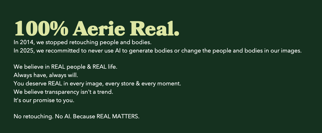
Look at what the brands getting credit for “anti-AI” stances are actually selling. Aerie pledged “No retouching. No AI. 100% real people,” and engagement on the post jumped 75%. Equinox built a 2026 campaign called “Question Everything But Yourself” around unfiltered human portraits set against synthetic ones. Almond Breeze ran cheeky ads about not using AI in its creative. None of these brands are fighting AI. They’re using AI as a foil to say something they could have said any year of the last twenty.

Aerie has been telling this story since 2014. The “100% Aerie Real” line predates ChatGPT by almost a decade. AI didn’t change Aerie’s brand. It changed what Aerie’s brand sounds like in the room.

That’s the whole movement. Brands with a real point of view sound sharper now, because the average around them got blander. Brands without one are still in trouble, only louder.

What “human-made” actually signals to a buyer

The “human-made premium” framing is real, but the diagnosis is off. Customers aren’t paying more because a person’s fingerprint is on the work. They’re paying more because the work is specific. It addresses them. It picks a side. It risks something.

AI-generated copy and AI-generated visuals have a tell, and it isn’t a watermark. The tell is that nothing is at stake. The voice is hedged. The composition is symmetrical. The metaphor is one of the seven any model can produce on demand. Customers can feel the absence of decisions. They might not name it that, but they vote with their attention.

When people say they want “human” content, they usually mean they want content that knows who it’s for and isn’t afraid of being wrong about it. AI can technically do this, with a sharp brief and a strong editorial hand on top. The brands getting it right aren’t anti-AI. They’re anti-default.

The work the polish can’t fake

Here’s the part that matters for anyone building a brand right now.

The cheap parts of design got cheaper. Layout, color, type pairing, basic illustration, photo retouching, mood-board generation. Anything that was a craft skill in 2020 is a slider in 2026. That’s real, and it isn’t going back.

The expensive parts got more expensive. A point of view the company can defend in a board meeting. Naming that earns trademark protection and survives a Google search. A voice that sounds like one specific company, not a category. A visual identity that’s recognizable from a quarter-mile away with the logo cropped off. None of these get easier because the production layer got faster.

Twenty-six years in, the failures rhyme. The brands scrambling right now didn’t get killed by AI. They got exposed by it. The average work was carrying them. Now it isn’t.

What this means if you’re building a brand right now

Stop benchmarking your work against last year’s average. Last year’s average is now free. If your creative output looks like what a model produces on the second prompt, it’s not creative output anymore. It’s a placeholder.

Spend the saved time on the parts that don’t get cheaper. A defensible position. A brand voice that picks a fight, however small. A visual system that holds up when stripped to one element. The work that was always good is suddenly the only work that survives.

If you’re using AI, say so. If you aren’t, say that too. The brands winning right now aren’t winning because they’re anti-AI. Frankly, the team at Jacob Tyler is not anti-AI. We are anti -average. Our clients are winning because they decided what they actually believe before anyone wrote the brief.

If you’d rather not figure that out alone, that’s where we come in.

Why Rebrands Fail: The Strategy Most Companies Skip

Rebrands almost never fail because of the design. They fail because of what nobody talked about before the design started.

We’ve watched this play out for twenty-six years. A company decides it’s time. Leadership wants something fresh. The agency wins the project, sketches a few directions, the team picks the cleanest mark, and the new identity ships. Six months in, sales hasn’t moved. Customers haven’t noticed, or noticed and pushed back. Internal teams are still using the old templates because the new ones don’t fit how they actually sell. The CEO calls the agency to “tweak” the work. That call is not a creative problem. That call is a strategy problem that arrived dressed as one.

Industry research puts the rebrand failure rate near 40 percent, with another fifth of poorly executed rebrands losing meaningful chunks of their customer base in the months after launch (per analysis of rebrand mistakes across the last decade). The number is too high to be a coincidence, and it doesn’t drop because the next round of agencies are better designers. It drops when companies stop treating rebrands as visual exercises and start treating them as strategic ones.

This is the piece we wish more clients read before the kickoff meeting. Not because we’re trying to scare anyone out of doing the work. The work is worth doing. The cost of doing it wrong is a year of wasted budget, a confused sales team, and a customer base that quietly stops paying attention.

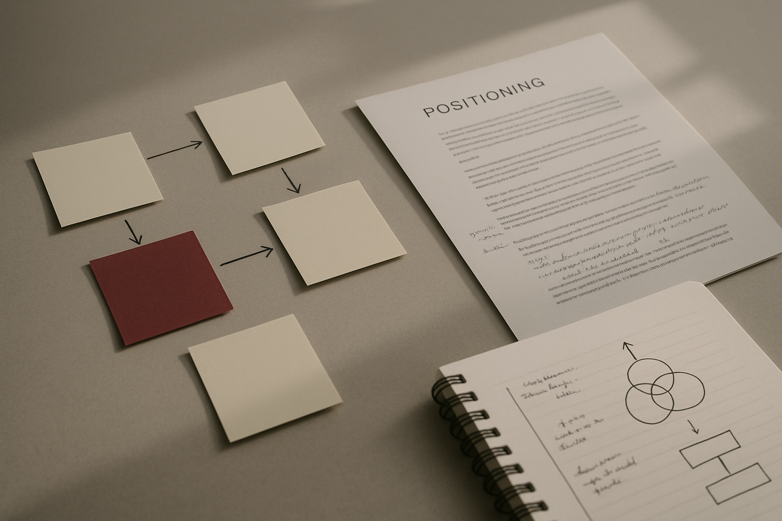
A desk with sticky notes mapping brand strategy paths, a printed positioning document with margin notes, and hand-drawn diagrams on a notepad.

Rebrands don’t fail because of the design

When a rebrand misses, the autopsy almost always blames the new logo. Tropicana lost roughly 20 percent in sales the month after their 2009 redesign. Gap retreated from theirs in six days. Yahoo iterated through three identities in five years and still couldn’t shake the perception of decline. Each of those is a design story on the surface. Underneath, they’re all the same story. The company didn’t know what it stood for, and the new identity made that visible.

Customers don’t reject new logos because the marks are ugly. They reject them because the logo doesn’t match the relationship they had with the brand. The visuals were never the contract. The contract was: this is who you said you’d be, and this is what you said you’d do. When a rebrand reveals that the company hasn’t decided either of those things, customers feel the gap. The design becomes a lightning rod for a problem that lived elsewhere all along.

Strong brands earn the right to change their visuals. Weak brands hide behind new ones. The harder a rebrand fights for attention, the louder it announces that the work underneath wasn’t done.

Why rebrands fail is rarely a creative problem

Read the postmortems on the public rebrand failures of the last few years and the same root causes appear. Customer research that didn’t happen. Stakeholder alignment that broke at the executive level. A positioning shift that nobody on the brand side could explain in a single sentence. A competitive analysis that ended at “we want to look more like X.” Heritage equity discarded for the wrong reason.

None of those are aesthetic problems. They are strategy gaps that the design phase exposes but cannot fix. Brand identity is downstream of brand strategy. When the strategy is missing, the identity has to do the work of two phases at once, and it always shows.

Mid-market companies hit this wall most often. They’re large enough to want the rebrand to feel substantial and small enough that one strong opinion in the executive room can override a decade of customer signal. Enterprise rebrands have more layers of approval, which is its own problem. The mid-market trap is specific. The founder, the new CMO, or the new investor walks in with a clear visual preference, and the strategic conversation gets compressed into a moodboard review. By the time the agency presents identity directions, the conversation that should have happened is six months behind.

Four kinds of rebrands, and why companies pick the wrong one

Not every rebrand is the same animal. Knowing which one you’re actually doing is half the work. Most companies misdiagnose this on day one and spend the next twelve months building the wrong thing.

  1. Refresh. You keep the equity, modernize the system. The wordmark stays recognizable. The palette tightens. Typography catches up with where the brand wanted to be five years ago. This is the right call when the strategy is solid, the audience hasn’t shifted, and the visuals just feel dated. It’s also the right call far more often than companies want to admit, because it’s harder to sell internally as transformation.
  2. Refocus. The strategy has shifted, the audience has narrowed or expanded, and the brand needs to express a new center of gravity. The visual system changes meaningfully, but the company is still recognizable to its existing customers. This is the most common rebrand done well. It’s also the one most often disguised as a refresh because the strategy work feels uncomfortable.
  3. Rebuild. The company is functionally a different business than it was. Acquisition. Pivot. New core product. New buyer entirely. The old name might survive, but everything else gets rethought from positioning down to the URL. Done right, this works. Done because someone is bored with the old brand, this becomes the case study other agencies use to scare clients.
  4. Rename. The rarest and the riskiest. You’re throwing away the equity in the name itself, which means the new brand has to earn recognition from zero while the old one still echoes. Reserve this for genuine reasons. Legal. Geographic expansion. A name that no longer reflects the business at all. Almost never do this for stylistic reasons.

The mistake we see most often is companies who needed a refresh ordering a rebuild, and companies who needed a rebuild ordering a refresh. The rebuild crowd burns equity they didn’t have to. The refresh crowd ships an identity that can’t carry the new strategy and has to redo the work eighteen months later. The first hour of any rebrand engagement should answer this question, not the last.

A clean office wall pinned with rows of design direction printouts, abstract shape studies, and color swatch cards arranged in clean grids.

The audit you keep skipping. What a real one finds.

A brand audit is not a slide of your existing logos with notes about kerning. A real audit is a diagnostic tool. It connects what your brand currently does to what your business actually needs, and it surfaces the gaps you’ll spend the next year trying to close.

What a useful audit looks at, in order:

  • Customer perception. Not what your team thinks the brand stands for. What buyers, lapsed buyers, and prospects actually associate with you. This is where the comfortable assumptions die first.
  • Internal alignment. Whether the executive team, sales, and product can describe the brand the same way without coordinating their answers in advance. This is the single best predictor of whether the rebrand will hold up under pressure.
  • Competitive position. Where you sit in the buyer’s mental map relative to the three or four companies they consider you against. The goal is not to be different in every direction. The goal is to be different in the direction that matters to the buyer’s decision (a useful B2B brand-audit framework lives here).
  • Brand equity inventory. What you’ve already built that’s worth keeping. Most rebrands underweight this. The equity in a familiar name, a recognizable color, or a tone of voice that customers expect is harder to rebuild than to preserve.
  • Activation gap. Where the brand promise lives strongly and where it falls apart. Onboarding. Sales materials. Support touchpoints. The website’s third-level pages. The rebrand has to plan for those, or the new identity dies inside the existing operations.

Companies that run this kind of audit before identity work usually conclude they need less of a rebrand than they thought, and a sharper one. That’s the right outcome. A small, decisive change applied to a clearer position outperforms a large, uncertain change applied to a fuzzy one every time.

The AI-rebrand era is making it worse, not faster

The new wrinkle in 2026 is that AI lets companies generate identity directions in days. That sounds like a productivity gain. In practice, it’s compressing the strategy phase to almost nothing because the visual phase looks so cheap. If a logo costs an afternoon, why spend three months on positioning?

Because the logo is the easy part. Always was.

We’ve seen mid-market clients show up with twenty AI-generated identity directions and a calendar that compresses strategy into a single workshop. The directions look polished. They also look like every other brand running the same prompts on the same tools. Recent research in Trends in Cognitive Sciences confirmed what creative directors have been saying out loud. AI-generated content trends toward statistical similarity over time. Same models. Same prompts. Same training data. Same output pattern. Distinctive isn’t an AI default. Distinctive is what humans force into the work.

This is the next decade’s competitive advantage and it is unglamorous. The brands that will stand out are the ones whose strategy is clear enough that the visual execution can’t dilute it. AI helps if you know what you’re trying to express. AI hurts if you don’t, because it gives you twenty reasonably good directions for a brand whose positioning isn’t reasonable yet.

A useful test: if your company can’t write its positioning in two sentences a board member could repeat, no amount of identity exploration will fix the problem. Spend that month on the positioning. The identity becomes obvious afterward.

A closed laptop next to a hand-drawn brand strategy diagram in an open notebook, an analog ruler, a fountain pen, and annotated printouts.

The first 90 days of a rebrand that lands

The rebrands that work tend to follow the same arc. None of it is glamorous. All of it is unskippable.

In the first thirty days, the team runs the audit. Customer interviews. Internal stakeholder interviews. Competitive review. Brand equity inventory. The deliverable at the end of this month is not a deck of mood boards. It’s a clear statement of what the brand currently is, what the business needs the brand to become, and what the gap looks like. If the team can’t articulate that gap in one paragraph, the next sixty days will not save the work.

In days thirty to sixty, the strategy lands. Positioning. Voice. The narrative that explains the company to a buyer who has never heard of it. Architecture, if it’s a multi-product company. The deliverable is a strategic platform that can be defended without slides. If the executive team can read it back to each other and not flinch, the team is ready to design.

Days sixty to ninety are when identity work begins, not where it ends. The visual system. The voice in market. The system documentation. The rollout plan. This is the part most companies want to start in week one. Starting it in week nine is what makes it work.

The 90-day arc is not a magic number. Some rebrands need six months for the strategy phase alone. Some need less. The point is the order. Audit, then strategy, then identity, then activation. Skip the order and you become the case study nobody wants to be in.

Brand strategy is the part nobody can outsource to a tool

Rebrands fail in 2026 for the same reason they failed in 2006. Companies decide what the brand should look like before deciding what it should be. The tools have changed. The tools have gotten faster. The mistake hasn’t moved.

If you’re considering a rebrand, you have one decision to make before you talk to any agency, including ours. Decide whether you’re solving a strategy problem or a design problem. If you don’t know, you have a strategy problem. The audit will prove it. The fix is harder than a redesign and worth more than one. If you’d rather not figure that out alone, that’s where we come in.