Well… we did it. We launched a new website. You know how the old business saying goes; “We’re our own worst client”. That’s true for many and very true for us. We seem to always put ourselves last in the “to-do list” pecking order. However, after months of work, back-and-forth, opinions, changes, and procrastination, we have created an experience that we feel works for us AND the people visiting. In other words, this is yet another Web design we are proud of. We (our team) have a saying that websites are like dog years—every year online is equivalent to seven years in technology evolution. It’s a playful metaphor that captures a serious truth about digital longevity in our rapidly changing industry. Yet despite this accelerated aging, both our own websites and those we create for clients have consistently defied the odds, averaging an impressive eight-year lifespan that speaks to thoughtful design and strategic planning.
Today, we’re taking a journey through our own digital evolution, examining how our website has transformed over the years and what these changes reveal about broader trends in web design, user behavior, and technological advancement.
Version 1: The Foundation Years (Early 2000s)
Our first website was a product of its time—clean, corporate, and information-focused. The design featured our signature red branding with a structured layout that prioritized content hierarchy and professional presentation. Navigation was straightforward, with clear sections for services, portfolio, and contact information.
This early iteration reflected the web standards of the early 2000s: fixed-width layouts, table-based structures, and a desktop-first mentality. Users were patient with longer load times and comfortable with scrolling through dense information.
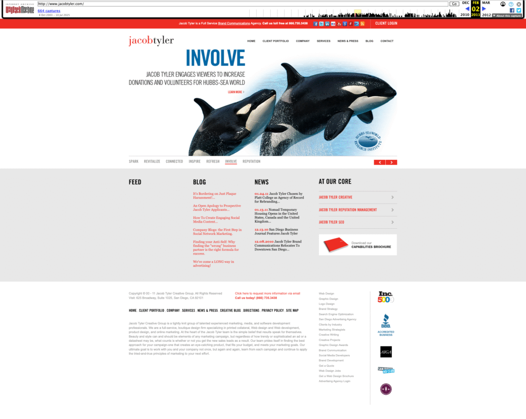
Key characteristics of Version 1:
- Static, information-rich design
- Desktop-only optimization
- Traditional corporate aesthetic
- Content-heavy approach
- Clear service differentiation
Version 2: The Interactive Revolution
Our second go-around was a total game-changer (at least to us). We ditched the static, corporate look and went big—think larger images, video content (super high-tech at the time), and interactive stuff that actually made people feel something when they landed on our site. Instead of just showing our work like a boring gallery, our case studies started telling real stories with visuals that packed a punch.
This was right when everyone was really getting overly obsessed with Facebook and Instagram (just getting started), and suddenly every brand needed to be a storyteller. So we flipped the script on how we presented our portfolio. Instead of just saying “Hey, look what we made,” we started showing “Here’s how our creative work actually moved the needle for our clients.” We stopped being an information dump and started creating experiences that people actually wanted to stick around for.
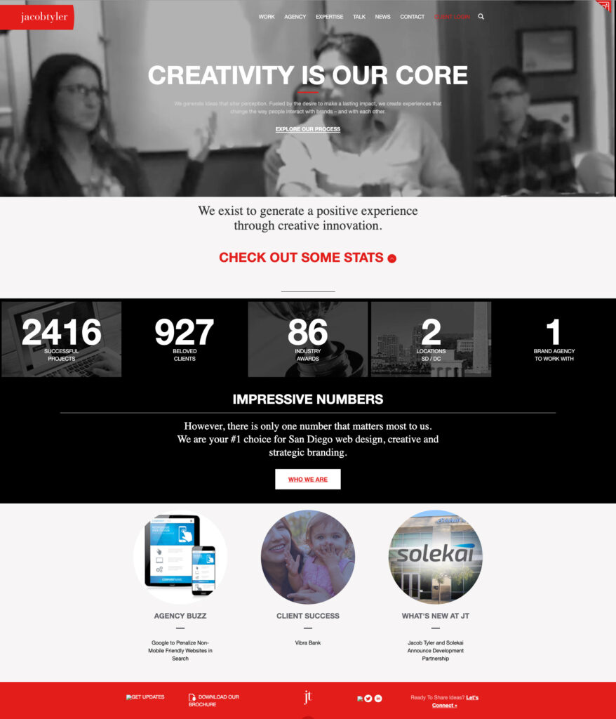
Notable improvements in Version 2:
- Enhanced visual storytelling
- Interactive portfolio elements and video
- Stronger emotional connection
- Social media integration
- Results-focused case studies
Version 3: Mobile-First Thinking
The third generation of our website represented our adaptation to the mobile revolution. As smartphones and tablets became ubiquitous, we redesigned with responsive principles at the core. The layout became more flexible, typography scaled appropriately across devices, and navigation transformed to accommodate touch interfaces. At the time, everyone was asking us who designed from mobile phones. And of course, this is extremely important however, a lot of companies that we work with, including us actually have less views on mobile platforms even to this day. That’s because in the business to business environment, many people are doing their research on their laptops and desktop devices.
Also, suddenly, scrolling became natural—people were swiping and scrolling with their thumbs all day long. Mobile screens were small, so longer pages made more sense than trying to cram everything into tiny viewports. That became the norm for desktop as well.
This was also when we started playing around with all the shiny new web tech and jumped on trends like parallax scrolling and those tiny animations that make everything feel more alive. We even spent some time wondering if we should design for the Apple Watch—yeah, that was a thing for about five minutes. Looking back, it’s a good reminder that just because something’s new and buzzy doesn’t mean you need to go all-in, but it’s still worth checking out to see if it’s actually useful or just another flash in the pan.
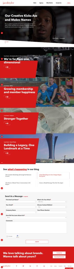
The mobile-first approach fundamentally changed how we structured content:
- Responsive design principles
- Touch-friendly navigation
- Optimized loading speeds
- Progressive enhancement
- Cross-platform compatibility
Version 4: The Current Era – Bold, Creative, and Results-Driven
Our latest website embodies everything we’ve learned about effective digital experiences. The tagline “Our Creative Kicks Ass and Makes Names” was the only copy that stayed from the previous website because it immediately establishes our confident, results-oriented approach while maintaining the professional credibility our global clients expect.
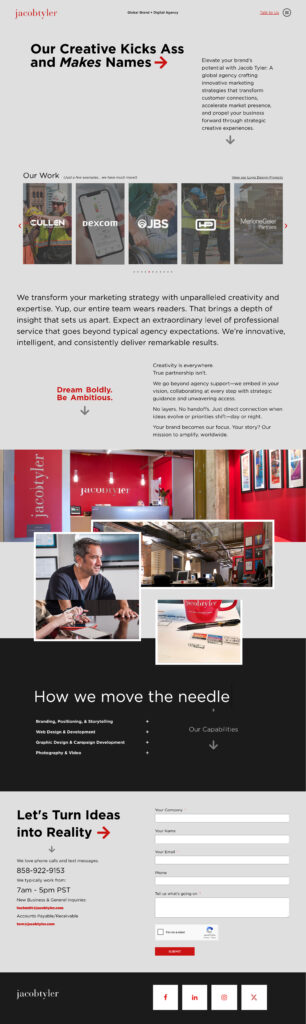
The current design features:
- Bold Visual Hierarchy: Large typography and strategic use of white space guide users through our story
- Integrated Case Studies: Portfolio pieces are woven throughout the experience.
- Multi-Device Optimization: Seamless experiences across desktop, tablet, and mobile devices
- Performance Focus: Fast loading times and smooth interactions enhance user engagement
- Conversion-Oriented: Strategic placement of contact forms and calls-to-action drive business results
The Importance of Strategic Redesign
Each evolution of our website wasn’t driven by boredom or aesthetic trends—it responded to fundamental shifts in user behavior, technology capabilities, and business objectives. This strategic approach to redesign offers several key benefits:
Technological Relevance
Keeping pace with web standards, security protocols, and performance expectations ensures your site remains functional and trustworthy.
User Experience Evolution
As user expectations change, websites must adapt to meet new interaction patterns and consumption preferences.
Brand Maturation
Your digital presence should evolve alongside your business, reflecting growth, expanded capabilities, and refined positioning.
Competitive Advantage
Regular updates help maintain differentiation in increasingly crowded markets.
Search Engine Optimization
Fresh content, improved site structure, and modern technical implementation boost search visibility.
Lessons from Our Journey
Our two-decade website evolution offers several insights for businesses considering their own digital transformation:
1. Plan for Longevity: While we joke about dog years, our eight-year average lifespan proves that thoughtful design and solid technical foundation can extend website value significantly.
2. Embrace Change Gradually: Each iteration built upon previous successes rather than starting from scratch, ensuring continuity while enabling innovation.
3. User-Centric Design Wins: Our most successful redesigns prioritized user needs over internal preferences or fleeting design trends. This applies for our clients as well.
4. Technology Should Enable, Not Drive: We adopted new technologies when they enhanced user experience, not simply because they existed.
5. Content Strategy Matters: Effective websites balance engaging presentation with substantial, valuable content that serves user intent.
Looking Forward
As we continue evolving our online presence, we’re already anticipating the next wave of changes: voice interfaces, AI-powered personalization, generative search, and immersive technologies that will reshape how users interact with brands online.
But regardless of technological advancement, our core philosophy remains constant: create experiences that connect with users, drive business results, and stand the test of time. After all, in an industry where dog years apply, longevity is the ultimate measure of success.
The Jacob Tyler website journey demonstrates that strategic redesign isn’t about chasing trends—it’s about thoughtfully evolving to serve users better while achieving business objectives. Whether you’re considering your first major redesign or your fourth, remember that the best websites aren’t just built to impress today’s visitors, but to adapt and thrive for years to come.
Ready to discuss how your website design can evolve to meet changing user expectations and business goals? Let’s start that conversation.