The Web Design Evolution of Jacob Tyler: A Digital Timeline Spanning Two Decades

Well… we did it. We launched a new website. You know how the old business saying goes; “We’re our own worst client”. That’s true for many and very true for us. We seem to always put ourselves last in the “to-do list” pecking order. However, after months of work, back-and-forth, opinions, changes, and procrastination, we have created an experience that we feel works for us AND the people visiting. In other words, this is yet another Web design we are proud of. We (our team) have a saying that websites are like dog years—every year online is equivalent to seven years in technology evolution. It’s a playful metaphor that captures a serious truth about digital longevity in our rapidly changing industry. Yet despite this accelerated aging, both our own websites and those we create for clients have consistently defied the odds, averaging an impressive eight-year lifespan that speaks to thoughtful design and strategic planning.

Today, we’re taking a journey through our own digital evolution, examining how our website has transformed over the years and what these changes reveal about broader trends in web design, user behavior, and technological advancement.

Version 1: The Foundation Years (Early 2000s)

Our first website was a product of its time—clean, corporate, and information-focused. The design featured our signature red branding with a structured layout that prioritized content hierarchy and professional presentation. Navigation was straightforward, with clear sections for services, portfolio, and contact information.

This early iteration reflected the web standards of the early 2000s: fixed-width layouts, table-based structures, and a desktop-first mentality. Users were patient with longer load times and comfortable with scrolling through dense information.
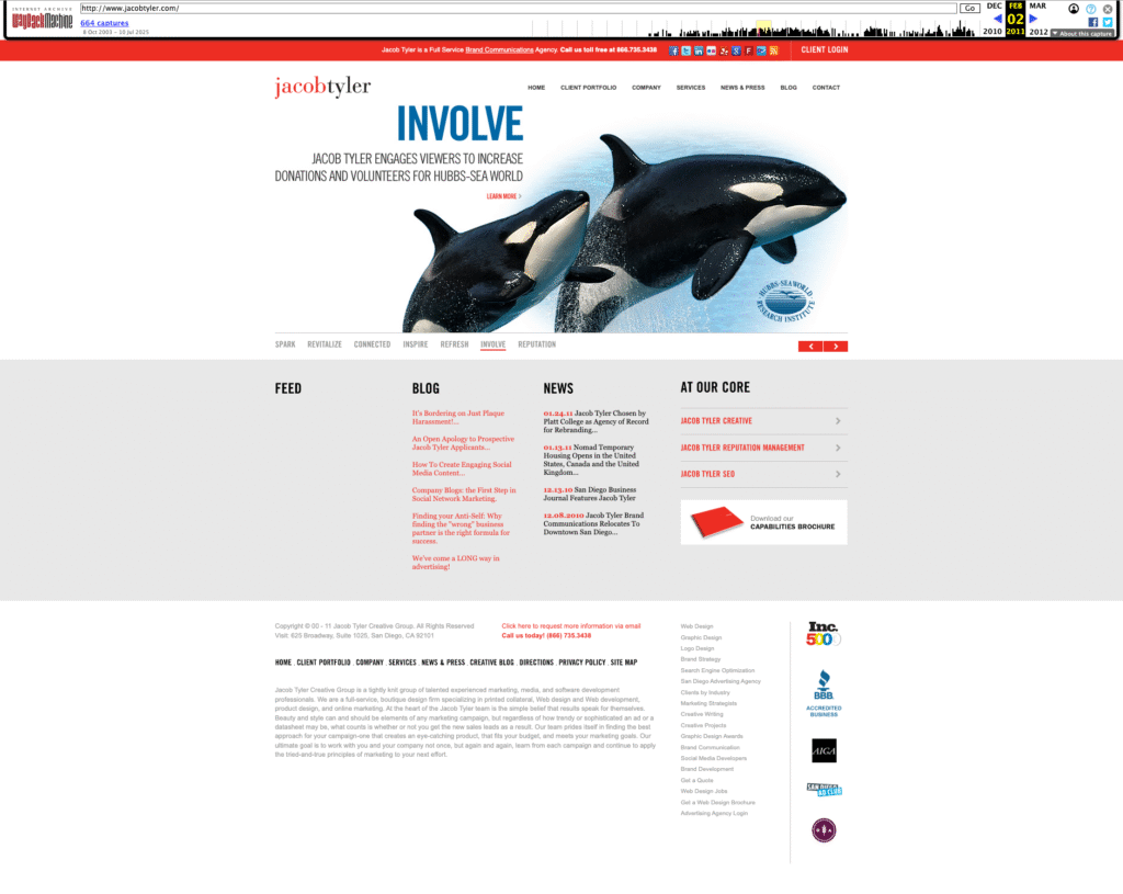
 

Key characteristics of Version 1:

  • Static, information-rich design
  • Desktop-only optimization
  • Traditional corporate aesthetic
  • Content-heavy approach
  • Clear service differentiation

Version 2: The Interactive Revolution

Our second go-around was a total game-changer (at least to us). We ditched the static, corporate look and went big—think larger images, video content (super high-tech at the time), and interactive stuff that actually made people feel something when they landed on our site. Instead of just showing our work like a boring gallery, our case studies started telling real stories with visuals that packed a punch.

This was right when everyone was really getting overly obsessed with Facebook and Instagram (just getting started), and suddenly every brand needed to be a storyteller. So we flipped the script on how we presented our portfolio. Instead of just saying “Hey, look what we made,” we started showing “Here’s how our creative work actually moved the needle for our clients.” We stopped being an information dump and started creating experiences that people actually wanted to stick around for.
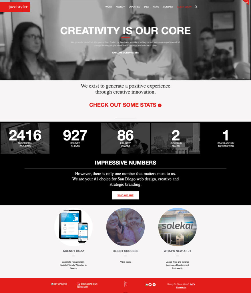
Notable improvements in Version 2:

  • Enhanced visual storytelling
  • Interactive portfolio elements and video
  • Stronger emotional connection
  • Social media integration
  • Results-focused case studies

Version 3: Mobile-First Thinking

The third generation of our website represented our adaptation to the mobile revolution. As smartphones and tablets became ubiquitous, we redesigned with responsive principles at the core. The layout became more flexible, typography scaled appropriately across devices, and navigation transformed to accommodate touch interfaces. At the time, everyone was asking us who designed from mobile phones. And of course, this is extremely important however, a lot of companies that we work with, including us actually have less views on mobile platforms even to this day. That’s because in the business to business environment, many people are doing their research on their laptops and desktop devices.

Also, suddenly, scrolling became natural—people were swiping and scrolling with their thumbs all day long. Mobile screens were small, so longer pages made more sense than trying to cram everything into tiny viewports. That became the norm for desktop as well.

This was also when we started playing around with all the shiny new web tech and jumped on trends like parallax scrolling and those tiny animations that make everything feel more alive. We even spent some time wondering if we should design for the Apple Watch—yeah, that was a thing for about five minutes. Looking back, it’s a good reminder that just because something’s new and buzzy doesn’t mean you need to go all-in, but it’s still worth checking out to see if it’s actually useful or just another flash in the pan.
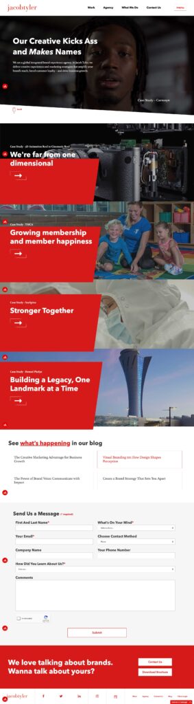
The mobile-first approach fundamentally changed how we structured content:

  • Responsive design principles
  • Touch-friendly navigation
  • Optimized loading speeds
  • Progressive enhancement
  • Cross-platform compatibility

Version 4: The Current Era – Bold, Creative, and Results-Driven

Our latest website embodies everything we’ve learned about effective digital experiences. The tagline “Our Creative Kicks Ass and Makes Names” was the only copy that stayed from the previous website because it immediately establishes our confident, results-oriented approach while maintaining the professional credibility our global clients expect.
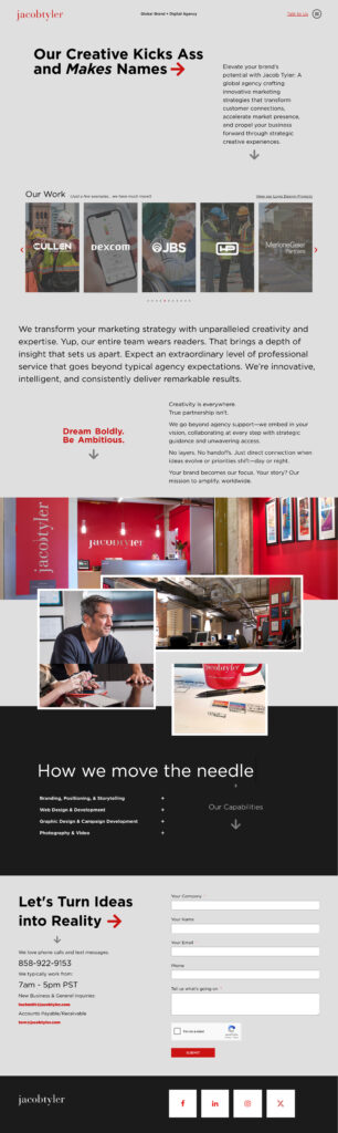
The current design features:

  • Bold Visual Hierarchy: Large typography and strategic use of white space guide users through our story
  • Integrated Case Studies: Portfolio pieces are woven throughout the experience.
  • Multi-Device Optimization: Seamless experiences across desktop, tablet, and mobile devices
  • Performance Focus: Fast loading times and smooth interactions enhance user engagement
  • Conversion-Oriented: Strategic placement of contact forms and calls-to-action drive business results

The Importance of Strategic Redesign

Each evolution of our website wasn’t driven by boredom or aesthetic trends—it responded to fundamental shifts in user behavior, technology capabilities, and business objectives. This strategic approach to redesign offers several key benefits:

Technological Relevance

Keeping pace with web standards, security protocols, and performance expectations ensures your site remains functional and trustworthy.

User Experience Evolution

As user expectations change, websites must adapt to meet new interaction patterns and consumption preferences.

Brand Maturation

Your digital presence should evolve alongside your business, reflecting growth, expanded capabilities, and refined positioning.

Competitive Advantage

Regular updates help maintain differentiation in increasingly crowded markets.

Search Engine Optimization

Fresh content, improved site structure, and modern technical implementation boost search visibility.

Lessons from Our Journey

Our two-decade website evolution offers several insights for businesses considering their own digital transformation:

1. Plan for Longevity: While we joke about dog years, our eight-year average lifespan proves that thoughtful design and solid technical foundation can extend website value significantly.

2. Embrace Change Gradually: Each iteration built upon previous successes rather than starting from scratch, ensuring continuity while enabling innovation.

3. User-Centric Design Wins: Our most successful redesigns prioritized user needs over internal preferences or fleeting design trends. This applies for our clients as well.

4. Technology Should Enable, Not Drive: We adopted new technologies when they enhanced user experience, not simply because they existed.

5. Content Strategy Matters: Effective websites balance engaging presentation with substantial, valuable content that serves user intent.

Looking Forward

As we continue evolving our online presence, we’re already anticipating the next wave of changes: voice interfaces, AI-powered personalization, generative search, and immersive technologies that will reshape how users interact with brands online.

But regardless of technological advancement, our core philosophy remains constant: create experiences that connect with users, drive business results, and stand the test of time. After all, in an industry where dog years apply, longevity is the ultimate measure of success.

The Jacob Tyler website journey demonstrates that strategic redesign isn’t about chasing trends—it’s about thoughtfully evolving to serve users better while achieving business objectives. Whether you’re considering your first major redesign or your fourth, remember that the best websites aren’t just built to impress today’s visitors, but to adapt and thrive for years to come.

Ready to discuss how your website design can evolve to meet changing user expectations and business goals? Let’s start that conversation.

5 Reasons Why Content Marketing Should be an Integral Part of Your B2B Marketing Strategy

Content marketing is one of the most effective ways for B2B brands to establish a strong online presence and reach out to potential customers—and it’s become a necessity for B2B brands. By creating and sharing valuable, relevant, and engaging content, B2B brands can build trust and credibility with their audience, generate leads, and ultimately, drive more sales. Let’s explore the benefits of content marketing for B2B brands in more detail:

Builds Brand Awareness

Creating high-quality and pertinent content that resonates with your target audience is an excellent way to increase your brand’s visibility and establish it as a thought leader in your industry. By consistently creating and sharing valuable content, you can attract and retain the attention of your target audience, which will help to increase brand awareness and recognition. It also gives you a chance to “speak” at length to your audience, educating them on your offering before they become a warm lead. 

Pro Tip: Create a brand messaging guide to ensure your tone and messaging are consistent to get the most impact out of your content. Get in touch if you need help creating your brand messaging

 Increases Website Traffic

 By creating high-quality content that is optimized for search engines, you can attract more organic traffic to your website. Search engines reward websites that provide valuable and relevant content to their users. By incorporating keywords, optimizing headlines, and using meta descriptions, you will boost your website’s search engine rankings, attract more traffic, and ultimately, generate more leads.

Pro Tip: Chat GPT is all the rage right now—but be cautious when using AI generated content. Search engines like Google can detect fully AI-written content and can potentially rank it lower than human-written content. You can use AI to help get the structure of an article in place, but make sure you rewrite it in your brand’s voice 

Generates Leads

One of the most significant benefits of content marketing for B2B brands—and really, the main benefit—is that it can generate leads. By creating valuable content that addresses the pain points and challenges of your target audience, you can attract potential customers who are searching for solutions to their problems. By capturing their contact information through gated content, such as whitepapers, webinars, or eBooks, B2B brands can generate high-quality leads that are more likely to convert.

 Nurtures Leads

 Content marketing isn’t just about generating leads—it’s about nurturing them too. By creating content that addresses the specific needs and pain points of your leads, you can build trust and credibility which will help move the leads down through the sales funnel. By providing relevant and valuable content at each stage of the buyer’s journey, B2B brands can nurture leads and build long-term relationships with their customers.

Pro Tip: Install a chat feature or a way for potential customers to easily reach out to you and get answers they are looking for. Allowing customers to reach out to you increases your chances of conversion by 14.6%

 Improves Customer Retention

Content marketing is an effective tool for improving customer retention. B2B brands can build stronger relationships with their customers and encourage them to stay loyal through a consistent stream of valuable content. This ongoing education and support will help your customers achieve their goals and stay engaged with your brand.

 The Bottom Line:

Content marketing is a powerful tool for B2B brands looking to establish a strong online presence, generate leads, and drive more sales. So, if you are a B2B brand looking to grow your business, content marketing is something you should consider—and Jacob Tyler can help. 

Get in touch today to learn about how we can help your B2B brand boost its content marketing—and its sales. 


Brand Review: Rio 2016

Although the Olympic games have concluded, there are still valuable pieces of inspiration that will live on. When most people think of the term “brand”, images of sleek smart phones and white and green coffee cups come to mind. The Olympic brand presents a unique branding challenge that is by nature ever evolving, yet must represent the core concepts of the games. Branding a city in a way that can be both universally understood and uniquely distinctive can be a monumental task. Rio de Janeiro was a host city that many people had never been to but the design firm Tátil Design did an excellent job bringing the city to life in a thoughtful and intriguing way.

Here is how they did it:

A Huge Challenge

“To represent the Passion and Transformation of a city and an entire country, and project these values to the rest of the world. A brand that must express unity. Inspire achievement and optimism. Avoid clichés and present Rio de Janeiro as the site of the largest sporting event in the world — to its very own Cariocas, and to athletes and people around the world.”

rio-article-header-alt-e1458225119445

Brand Inspiration

“We designed a human brand, made of mixture of people, athletes and cultures. A brand that welcomes a hug and has an exciting way to celebrate. One way that reveals the Sugar Loaf and is living mirror of the lush nature of Rio de Janeiro and the city. A brand-carving, infinite, three-dimensional, winning textures, seen form object. Made to be experienced. An invitation and an inspiration to the river and to the world.”

rio-article-1

07

Color

“The natural beauty of our landscape is embodied by the brand and its color palette. Yellow symbolizes the sun and our warm, vivacious and happy nature. Blue expresses the fluidity of the water that surrounds us, and our easygoing way of life. Green represents our forests and hope, a positive vision that inspires us to go even further.”

bg-all

Shape

“Inspired by the rich landscapes of Rio and Brazil – full of the sinuous curves of mountains, rivers and lakes – the city’s best-loved icons, including Sugarloaf Mountain and Corcovado, the athletes and its people, the Brand of the 2016 Rio Olympic Games evokes unity, inspires the will and desire to work together, to share our knowledge and talents, to join forces and ambitions for a sustainable way of life that will transform the present and our future. It’s a brand that embodies unity, transformation, passion and energy. It’s a large collective network in motion, an invitation and inspiration to Rio and the world.”

The Rio Font

“Each letter expresses a characteristic of the Rio 2016 Games, its people and the city. The letters are written in single continuous strokes, with fast and fluid motions, suggesting the movements of the athletes in action. The strong contrast between thick and thin strokes was explored during the design process by putting brush to paper and writing by hand. The variety of the curves in the different letters has a unique informality, inspired by the joyfulness and warmth of the Brazilian people.”

rio-article-11

San Diego Digital Marketing Agency | Jacob Tyler

Behind the Name: How Kenneth Cole Inspired the Jacob Tyler Brand

Behind the Name: How Kenneth Cole Inspired the Jacob Tyler Brand

The name itself – Jacob Tyler – is named after my son, Jacob Tyler Kollegian. But the inspiration for the brand that Jacob Tyler has become, began at a clothing store in Grand Central Station in New York City.

Kenneth Cole Store

Let me rewind.

In the late 90s, I left a job as the creative director at a large agency to test the waters for new opportunities. While searching for a new job, I started to do some consulting work. To legitimize my new business, I registered the domain name “Vivid Commerce” to host my portfolio, figuring it made sense for a graphic designer that had a strong interactive design and development background– though I hadn’t really given it much thought.

Most of my clients at the time – large firms I had connections with from my agency work and referrals from friends – happened to be on the East Coast, mostly in New York City. So I often flew east from San Diego to work with them (in no small part because my “office” in San Diego at the time was my bedroom and my business attire consisted of boxer shorts and tee shirts).

From a wardrobe standpoint, I was chronically unprepared for New York. I never packed enough clothes. During many of my trips, I had to extend my stay and the last thing I had time to do was laundry. Knowing I couldn’t go back to the office in the same dirty shirt and tie yet again, I decided to buy some clothes on the way to the office. Wearing the previous day’s outfit, I took the train to Grand Central Station and walked into the Kenneth Cole store… luckily they opened at 8am. I bought a brand new shirt and tie, changed clothes in the fitting room and went off to work.

It became a routine.

Soon I was in Kenneth Cole up to three times a week, picking up new outfits. I was making decent money at the time, so had some “disposable” income but I kept going back because the clothes were reasonably priced, I thought they looked great on and the customer service was impeccable, always greeting me by name. Eventually, they had multiple outfits, pressed and ready to wear, for me to choose from every morning – whether I showed up or not.

2003

By 2003, my “consulting” business was taking off and my son was about to be born. We had decided to name him Jacob Tyler, and I decided to rebrand my company with the same name. Of course I loved the name itself – I had chosen it for my son – but it also reminded me of Kenneth Cole, a brand I wanted the Jacob Tyler brand to emulate.

Whenever I left that Kenneth Cole store, I felt and looked great. I wanted Jacob Tyler’s clients to feel the same way. I wanted Jacob Tyler to be the Kenneth Cole of graphic design. Like Kenneth Cole, at Jacob Tyler, we provide a great customer experience and top-quality products at a reasonable price.

The inspiration I took from my experience at Kenneth Cole in those early days in New York became the heart and soul of the Jacob Tyler brand. And really, that’s what a brand is – a living, breathing thing. It’s your organization’s culture. It’s the people. It’s what you deliver and how you deliver it. It’s something you live every day.

The name Jacob Tyler and our visual representation embody our brand and agency. They communicate who we are and what we’re about. But it’s our culture that defines us. For more than a decade, we’ve cultivated our brand and grown with it, but have never lost sight of those early principles I learned from Kenneth Cole.

On the Eleventh Day of Creative: Eva Mann


As told by Senior Brand Manager, Amanda Schremser


On the Eleventh Day of Creative, I want to share a project that’s extra merry and bright, and nothing says bright quite like Hollywood runway models, sequin tailored uniforms and the lights of a fashion photoshoot!


11908612_10204640207955167_8785239627164510971_o


When we think fashion, our minds immediately go to the likes of Channel, Marc Jacobs and Vera Wang. But what about the fashion that surrounds our every day lives–the fashion we don’t find on the racks at Nordstoms?


Eva Mann Designs is a fashion forward company who focuses on specialty tailored uniform wear.When you experience brands like Caesar’s Palace, Medieval Times or Margaritaville, Eva Mann Designs is in the details and their uniforms are playing a major part in delivering those experiences.


EM Designs has been around for over 20 years, and like any strong designer, knew it was time for a brand modernization. Jacob Tyler was tasked with updating the EM logo, directing a photo shoot for a new uniform line, creating a brochure to showcase their specialties and most important, redesigning their website.


Eva Mann Jacob Tyler 11 Day Xmas


Just like Eva’s one-of-a-kind uniforms, Jacob Tyler made sure everything we created for EM Designs was fabulously fashionable yet functional. And since responsification is the new black, we made sure to perfectly pair their site with innovation as well: evamanndesigns.com


So the next time you walk into the Hard Rock, Bally’s or one of Trump’s hotels or spas, make sure to pay extra close attention to your valet’s top hat, your waiters tuxedo or your nightly visual entertainer’s headdress. There is a good chance Eva’s team created it and Jacob Tyler is proud to have contributed to such a fine brand.


Marketing in San Diego

On the Eighth Day of Creative: e.Digital

As told by Visual Designer, Lisa Inoue

On the Eighth Day of Creative, I’m excited to share a sneak peek into some work we’re doing for our client e.Digital. Since our initial kickoff, I’ve been inspired by their twenty-four year history of creating game-changing foundational technologies that are at the core of wireless headset, digital audio/video recorder and portable music player markets. The more I’ve learned about their vast innovations that fuel many of the consumer products we rely on every day, the more excited I’ve become about the opportunity to work on this project.

Tasked with revamping their brand identity to portray them as the innovation leader they are, I worked closely with our ACD to explore, and design various logo concepts. With several great logos to choose from, we have since landed on a winner which you can see a teaser of in the included photo. We’ll leave it to e.Digital to share the full reveal, so hang tight.

With the new identity in place, we moved into phase two which includes developing a new digital strategy and creating a website that just as the logo, portrays e.Digital as the leader in foundational technologies. My favorite part of this project was hearing about their milestones throughout the years and translating those into a stunning timeline of innovations that will be a focal point of the new site. As much as I’d love to share that, we’re a matter of weeks away from launch so you’ll just have to wait it out.

edigital

Digital Marketing in San Diego | Jacob Tyler

On the Sixth Day of Creative: Thorsnes Litigation Services

As told by Brand Director, Sean Connacher…

On the Sixth Day of Creative, I’m hedging my bets on sharing the latest creative/strategic/business-driving work we are developing for our friends at Thorsnes Litigation Services.

This company has built a strong reputation delivering end-to-end litigation solutions to its end clients — everything from depositions to e-discovery to trial support (presentations/graphics/etc). We are currently working with them to strengthen their brand so that it represents the true value they provide to clients, and overhauling their website so that it is more intuitive and drives users to convert. As partners we’ve mutually identified and agreed upon a handful of exciting new opportunities, all of which are still ‘in the oven.’

Photos? No can do! We’re on an NDA basis and the last thing I’m going to do is give our friends — who happen to be in the litigation business — a reason to be litigious.

Happy Holidays Jim, Erik, Emily and Julie!

ReBranding Company in San Diego

On the Second Day of Creative: Miramar Federal Credit Union

As told by our Art Director, Phil Windyk…

On the second Day of Creative, I’m happy to share the work that we did for our client Miramar Federal Credit Union. MFed is a San Diego based credit union that is committed to helping Members get the most from their personal and financial life — whether through financial education that empowers them, or solutions that give them greater freedom or the ability to live their dreams. MFed came to Jacob Tyler to reimagine their identity and make their new vision a reality.


Miramar_1 Miramar_2


The core concept behind the new MFed brand was pride. MFed wanted to attract a younger audience but they also wanted to create a brand that their members would be proud to be a part of. We focused on the idea of creating a military inspired badge that would serve as a symbol for employees, as well as the members, to stand behind. The MFed badge represents a commitment to serving those that serve us. When seeing someone proudly displaying the new emblem, there is a feeling of belonging and dedication to a greater good.


Miramar_3Miramar_4


Kevin proudly toted a shiny new MFed pin on the lapel of his jacket. When Kevin came up to me with a smile on his face and pointed to the pin, I knew that we had created something special for the brand and its Members to be proud of.


The new logo was a key part of the MFed identity evolution, but defining a new brand voice and establishing brand guidelines helped to arm the MFed marketing team with the tools they needed to move the company forward.

Earlier this week, a member of the MFed executive team was in the JT office. Kevin proudly toted a shiny new MFed pin on the lapel of his jacket. When Kevin came up to me with a smile on his face and pointed to the pin, I knew that we had created something special for the brand and its Members to be proud of.

Rebranding in San Diego | Jacob Tyler

On the First Day of Creative: Visionary Realms

As told by our ACD, Rick Gray…

On the first Day of Creative, I’m stoked to share the work we did for our client Visionary Realms – a gaming company that is revolutionizing the MMO(Massively Multiplayer Online) Genre by setting new standards for immersion, quality and vision. What sets them apart from all others is that their games are not just played, but rather experienced, shared and remembered by their fans for a lifetime.

visionaryrealms_talk1

Tasked with creating a brand identity that their ever-growing community of “true gamers” could get behind, along with a corporate website and a site to announce the launch of their highly anticipated premier game, Pantheon, we had our work cut out for us. Just as their games promise to provide an exciting challenge, so to did this project. In the Jacob Tyler way, we worked hand-in-hand with the Visionary Realms team, collaborating on concepts, executions, and even providing art direction that will effect the actual Pantheon game itself. 

visionaryrealms_talk2

With the goal of positioning Visionary Realms as the leader in the MMO genre, a truly social space to live in, what better way to gauge our success than with their Facebook community. With in minutes of posting the launch of the Pantheon site to their wall, the buzz was astounding. Likes quickly grew well into the hundreds, as did the comments. We heard things like… 

Outstanding Site!!!”

Looks nice… A little too nice, sucked me right in!”

The site looks awesome! Rejuvenates my interest!”

Wow.. that is awesome ! didn’t expect that ! truly sick work “

Site looks nice! and works good on Mobile Phone!(Easy navigation), Great work!

The Visionary Realms community was thrilled with the work we provided for the Pantheon site, and equally as supportive of the brand we built for the parent company. Our success is a result of many facets of our overall process, but much credit is due to our unique discovery approach where we’re able to truly understand both our clients organization as well as the desires of their audience.

Check out Visionary Realms at: visionaryrealms.com

Check out Pantheon, The Rise of the Fallen at: pantheonmmo.com

VR_fb_post_4

Website Design in San Diego | Jacob Tyler

Is Your Brand a Crock Pot?

It’s that time of year again. A time to throw portion control and calorie counting into the fireplace. It’s a time where melted cheese reigns supreme. It’s Crock Pot Season!12274660_10153323349228507_2422566036580949659_n

A heated agency debate before our annual chili cook-off, spurred a question about the brands that we create. Is your brand a Crock Pot or a stoneware slow cooker? Crock Pot is a product, but it is also a brand that owns its category. Although many brands have come along that sell similar products, Crock Pot has been able to stand the test of time by releasing new products that embrace technology, while staying true to the core purpose of the brand. Save time, and make it easy. Crock Pot was created over four decades ago as a way to cook a flavorful, convenient, home-cooked meals without having to spend any time in the kitchen.


12274779_10153323453173507_2982917892590345249_n 12274338_10153323453008507_6738614875663996482_n


Brands that are able to stay true to their roots while continuing to advance, are the ones that take over (or create) their own lanes. Brands Like Kleenex, Coke, Band-Aid, Tupperware and Crock-Pot are brands that have become synonymous with their product categories. To create the next “Crock Pot”, determine what your brands purpose is, brand it and then own it. Be confident in your brand and never forget why it exists.

Jacob Tyler | San Diego’s Best Design Firm