Hensel Phelps, founded in 1937 and one of the largest general contractors in the US, builds landmark properties across the country. Their digital presence? Not so landmark.
The Jacob Tyler team partnered with Hensel Phelps to bridge that gap—refreshing their brand, crafting intuitive web experiences, and creating visuals that showcase their world-class portfolio exactly as it deserves to be seen.

Rebranding a global company with over 4,000 pages involves balancing brand consistency across diverse markets while preserving SEO rankings and search authority. The challenge requires restructuring information architecture for intuitive navigation, consolidating redundant content, and managing complex content migration without disrupting user workflows. Success depends on simultaneously updating brand identity, technical infrastructure, and content strategy while maintaining institutional knowledge and ensuring stakeholders across multiple geographic markets can quickly find the information they need.

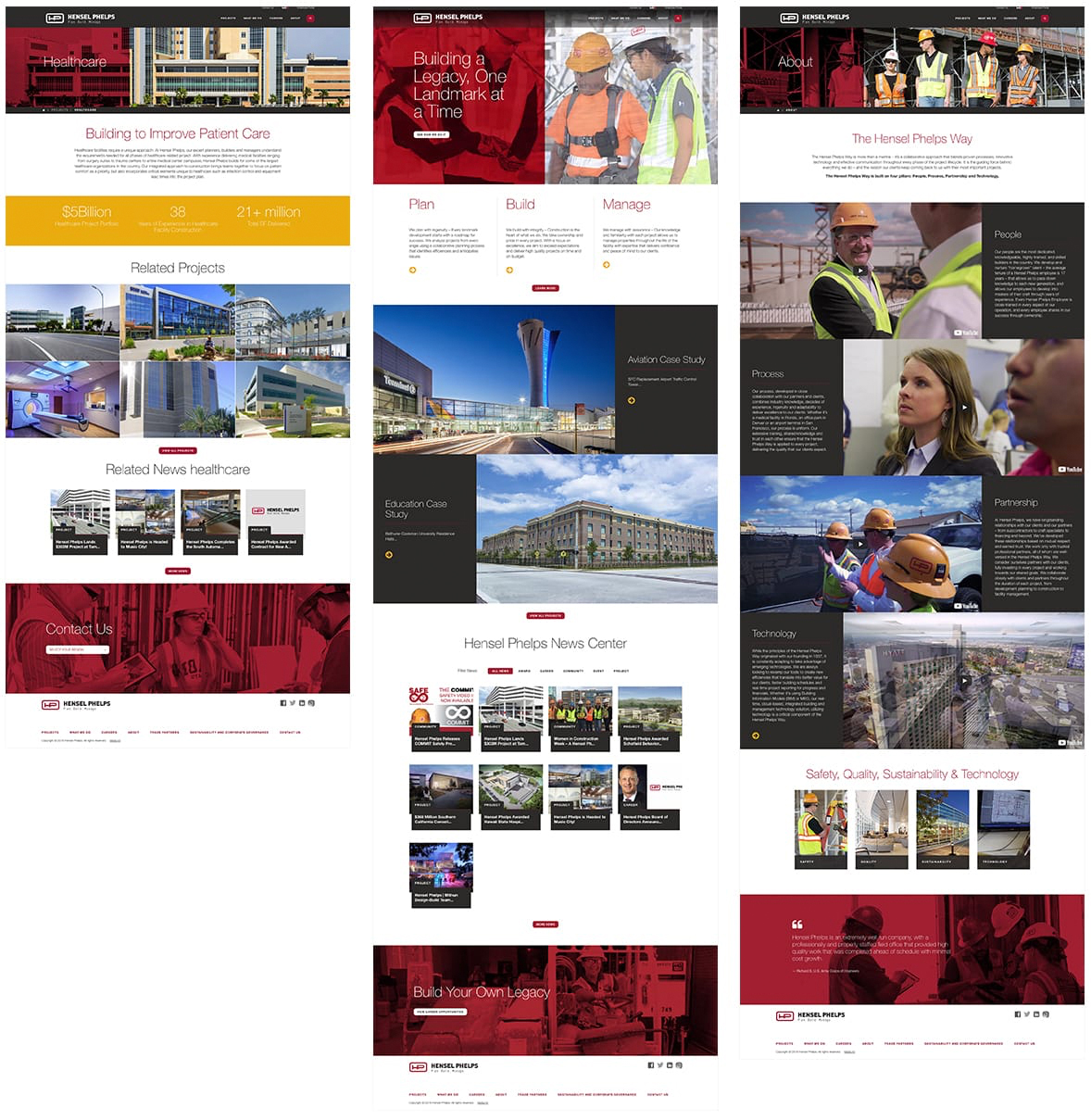
Jacob Tyler’s digital approach centered on transforming Hensel Phelps’ extensive portfolio into a powerful storytelling mechanism that would drive user engagement and reinforce brand authority. Rather than relying on generic corporate imagery, the solution strategically leveraged the company’s most impressive architectural achievements—from the iconic San Francisco International Airport to cutting-edge healthcare facilities like the pediatric research center in Austin—as the visual foundation for the entire digital experience.
This content-first strategy ensured that every page became a testament to Hensel Phelps’ construction expertise, with carefully curated building photography serving as both aesthetic elements and proof points of capability. The approach solved the dual challenge of creating visual cohesion while maintaining user interest through authentic, high-impact imagery that directly connected to the company’s core value proposition. By making their landmark projects the hero of the user experience, Jacob Tyler created a digital environment where navigation felt purposeful and every interaction reinforced Hensel Phelps’ reputation as a premier construction company capable of delivering extraordinary results.

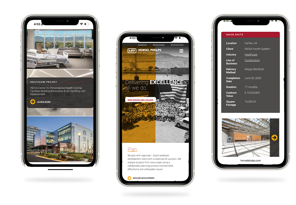
Despite mobile traffic representing less than 20% of total viewership compared to desktop’s dominant 80%, Jacob Tyler’s data analysis revealed distinct behavioral patterns that demanded a fundamentally different mobile experience. The mobile design strategy prioritized the specific content and functionality that on-the-go users actually sought—streamlined project portfolios, contact information, and key company capabilities—rather than simply shrinking the desktop experience. This approach recognized that mobile users exhibited different intent and context, often seeking quick access to project references, location details, or company credentials while traveling between job sites or client meetings.
By creating a mobile-first information hierarchy that surfaced the most relevant content based on actual usage patterns rather than traffic volume, the design ensured that the smaller but highly targeted mobile audience could efficiently accomplish their goals. This strategic departure from responsive design conventions demonstrated Jacob Tyler’s commitment to user-centered design principles, acknowledging that effective mobile experiences require thoughtful curation of content and functionality tailored to the unique needs of users accessing information while mobile, regardless of their proportional representation in overall site traffic.

